-

COMING JUNE 1ST
-One of the reasons we’ve been away recently… La Main Dans Le Sac, a film commissioned by Vogue Italia.

The Stimuleye presents
A Short Film With Jamin Puech
for Vogue Italia
“Caught red-handed”
Directed by Antoine Asseraf & René Habermacher
Styling by Michaela Dosamantes
Assisted by Alexia Hollinger
Starring Quinta Witzel @ IMG Paris
Make-Up by Tracy Alfajora
Hair by Romina Manenti @ Artlist
Assisted by Masako Hayashi
Filmed at Prunier, Paris
Music by Shane Aspegren & Lori Schonberg of The Berg Sans Nipple
Thank You: Lisa Kajita, Nicolas Barruyer, Erotokritos Antoniadis, Yoann Lemoine.
10 -
ERWIN BLUMENFELD: through the eyes of his son Henry.
-On the second day of the fashion and photography festival in Hyeres, I watched Henry Blumenfeld, elementary particle physicist and son of Erwin Blumenfeld, inconspicuously walking through the exhibit of his father’s work at the Villa Noailles. He was wearing a tan suit, sneakers and a baseball cap that was slightly crooked on his head. Before long, the spacious, bright room where the artist’s photographs and videos were being exhibited became empty and quiet. Only the slight hum of voices around the villa could be heard through the walls. Here, surrounded by a collection of stunning and rare examples of his father’s work — large-scale, restored prints — Henry sat down with us for an intimate conversation: Erwin Blumenfeld the artist, the father, the mentor and the man of perseverance.
by Lynsey Peisinger, Photography René Habermacher
 Son Henry Blumenfeld in front of his fathers DOE EYE with Jean Patchett for Vogue US 1950
LYNSEY PEISINGER: Where were you born?
HENRY BLUMENFELD: I was born in 1925 in Zandfoort near Amsterdam. My father had been an ambulance driver during the first World War. During the war, he had met my mother who was Dutch, Lena Citroen, who was a cousin of Pal Citroen, a German/Dutch artist. He grew up in Berlin with my father and they went to school together and they were very close friends. Through Pal, he met my mother and they corresponded during the war. My mother came to visit him in Germany when he was a soldier there. He tried to leave Germany, but he couldn’t. So, just after the war he came to Holland and then, a little bit later, married my mother in the early 20s. I guess, 1921. And because he was German and she was Dutch, she became German — that was the Dutch law at the time. I was born in Holland, but because I had a German father, I also became German.
LP: What was your father doing at that time?
HB: He was surviving. Leaving Germany at the end of the war, he tried to survive with the help of my mother and set up some kind of art dealing business with a friend, but that didn’t work very well. He was doing a lot of collage and kept in touch with other German Dadaists. After two years, he started to work as a clerk in a department store. Later, around the time I was born, he opened his own shop called the Fox Leather Company, selling ladies handbags and suitcases on the Kalvestraat. That went fairly well, but soon Hitler came to power and the business went badly and eventually bankrupt. That’s when he decided to become a photographer in 1934.

 ERWIN BLUMENFELD Exhibition at the villa Noailles Squash Court. Right: Erwin Blumenfeld OPHELIA 1947
RENE HABERMACHER: So your father’s first art oriented interest was collage and he was in the Dadaist movement?
HB: He was already interested in photography. He got his first camera when he was about 6 or 7. But his main interest was perhaps the theatre. That was something he was strongly attached to: the German language. His Dutch always remained a little bit feeble to say the least. He worked quite a lot, but with theatre in German language, he couldn’t make much of a living… With his collages he couldn’t make a living with that either but always kept in touch with the Germans — Grosz and Richard Huelsenbeck and other people of the Dadaist movement. Recently there was an exhibition in Berlin on this periods work of my father and a book has been published.
LP: Did he continue to do collage later on when he started doing photography?
HB: No. When he was doing collage, he was also painting — he was a Sunday painter: He did quite a bit of painting on Saturdays and Sundays. But he dropped doing his collage and the painting and started doing photography in Amsterdam. The business went rather poorly, he had health problems and more or less escaped to Paris around the 1st of January 1936. The first year it was very difficult for him to make a living. He got support from the family of his wife, of my mother. On his side he didn’t have much family left. His father had died before the first world war and his mother deceased shortly afterwards. He lost his brother in the war as a soldier in the German army and his sister died of Tuberculosis shortly after.
My father was friends with Walter Feilchenfeldt’s wife Marianne. He was a quite well known art dealer in Zurich. Mariane Feilchenfeldt helped him to rent his studio in Paris at 9 rue Delambre.
RH: So in Paris he got introduced to photography on a professional level?
HB: Already in Holland he was doing it on a professional level. He took many portraits and pictures there, but they didn’t sell much. He got in touch with some French people who came to Holland and they eventually supported him when he went to Paris — like Andre Girard the painter. Then, after about a year later, he started to sell photos to small photo magazines in the US and England, such as Lilliput. In 1937, he met british photographer Cecil Beaton who introduced him to Vogue. My father started to work for Paris Vogue in 1938.
When he was in Paris, he worked only in black and white. Color was not yet really developed for photography. It was very difficult for individuals to use color in their own studios, so he only did black and white while he was in Paris. I should mention that for his Paris period, his publications in Verve were very important. He had some of his striking black and white photos published in the first issues of that magazine. In the dark room, he experimented a lot, but only in black and white.
Then came the war and during the war, we were foreigners in france — we were not really refugees, but were without status, so it was quite difficult. In the beginning of the war, we were more or less exiled, we lived in a hotel in Vessely nine months, a sort of medieval town in Burgundy, France with a really nice cathedral. Then the Germans came and my father and sister were put in a camp. My mother and my brother and I, with the help of some Citroen cousins, managed to escape to the south of France. Our father was then in a rather horrible camp in France. We stayed in the Country until 1941, trying to get out. Then we managed to get a visa for the US — my father had been to the US already, in June of 1939. That was were, I think he took his first color photographs. He came back to France in July 1939 and he was stuck in France for two years. Then when we got to go to the US, he started working first with Harper’s Bazaar for two or three years, switched to Vogue and started doing color photography. At the time, he took his color pictures in the studio, using different color lights and so on — he was very experimental. But for the development and the printing, it was completely out of his hands. It was always done by Kodak. At the time, he couldn’t do anything in color on his own in the laboratory.
Most of these photos here were printed by Kodak. When I say printed, they weren’t really printed, they were large color transparencies. Like big negatives — 12 by 15 inches. I think that all of these photos here were taken in this large format and they were transparencies. The pictures were only printed for Vogue — working from the transparencies. Sometimes my father would give some direction on how they should be printed, but he was not generally involved in the printing itself. Only later, around 1956, they started to develop a new process called C-Prints. He bought the C-Print machine and he could start doing his own color. But C-Prints were very unstable as far as the color went — if they were exposed to light, in a few days they would essentially vanish. So all of his work in C-Print is essentially gone. Even the color transparencies that we have of his work have either faded or changed color a lot. Especially the reds, had faded. So, our doughtier Nadia has worked a lot with Olivier Berg at a laboratory in Lozère to try to restore the original colors. She is using the original publications because those prints have kept their color much better than the transparencies. So what you see in this exhibit is the result of the work that Olivier Berg and Nadia have done.
RH: Would you say that your father was somebody who was very progressive and pushing for new things in general?
HB: I don’t know about new things…. He was for the experimental, which is a little bit different. I don’t know if he was really striving for new things, but he tried to do do things differently and experimented. He was very much inspired by especially old painters like Goya and Renoir and much impressed by Picasso. I don’t know if he ever got to meet Picasso in Paris at the time. But he met quite a few artists as Dali and others.
 Erwin Blumenfeld advertising for PALL MALL circa 1957.
RH: But he liked the experimental, so maybe that was something that remained with him from the Dadaist movement?
HB: Yes, that was important to him.
LP: I heard Michel Mallard talking earlier about how remarkable it is that there was no photoshop or digital editing at that time… this image, this one with the lips and the eye, DOE EYE, where the nose is missing and there is color separation, was this done in the retouching process?
HB: This was done in the process of retouching. It was an original black and white picture. It was colored afterwards by my father and by Vogue. They worked on it together. That was a special case because the others that you see were done in color and then reworked. This one did not originally have these colors.
RH: When your father was working, did you often witness his process and how he worked in his studio?
HB: No. When he was in Paris, working in black and white, I was somewhat present. But afterwards, in the States, I was not really present anymore. So I didn’t really witness him working in color.
RH: Was his approach as a photographer more controlled or more spontaneous?
HB: I think both. He was quite controlled — all of these pictures here were taken in a studio. But he also traveled quite a bit in America and in Europe and he took many 35 millimeter color slides. Incidentally, the color of those slides kept much better than the color on the transparencies. But, in the studio, he was very controlled and would take many pictures to get something specific in a sitting.

 Left: Erwin Blumenfeld LE DECOLLETE 1952, RIGHT: Henry Blumenfeld in Conversation
LP: In Paris, were you present when he would shoot people in the studio?
HB: Sometimes, but not very often. I was more present when he was working in the dark room.
RH: I recently saw notes from Richard Avedon where he had a black and white print and he marked on it all of the places where he wanted the development to be darker or lighter using manipulation techniques in the dark room. Was your father working with these techniques too?
HB: Yes in the dark room, for black and white, he manipulated a lot. It would have been interesting to see what he would have done with color photography if he had been born fifty years later. At the time, the technology wasn’t there for him to do anything after a picture was taken in color.
RH: Where would your father have his intellectual and creative relationships — in other photography or painting etc?
HB: I would think painting. Very much painting, classical painting. Many of his photos were inspired by different painters. He was also inspired by modern life and by life in NY at the time, in the 40s and 50s. He liked jazz music very much, in the New Orleans style.
And he was quite interested in looking at television when it first came out. We got our first television set around 1950 or so. It was black and white at the time. I don’t think he ever saw color television. Maybe he saw it, but he never had one. He liked movies — but more for the content than for the photography. He liked Nanook of the North, about a Danish explorer. He was interested in movies — liked Erich Von Stroheim and he liked Sunset Boulevard and Billy WIlder.
RH: Was that love for cinema also what led to him making films?
HB: The filming was more in line with advertising. I think he was trying to see if he could use the filming for advertising, rather than to tell a story like in movies. Now you see everything mixed, advertising and movies. But at the time, it was an experiment.
RH: Do you think that your father really divided the things that he did for himself and the things that he was commissioned to do? The time after the war was quite commercial driven in America — was it easy for him to also do what he wanted to do?
HB: For one thing, the black and white and the color were two different things. In black and white, he could do what he wanted. In color, probably none of them were published in the exact way that they had been taken. They were made and developed specifically for Vogue. He did appreciate the possibility to work in color, but the whole fashion business and the way it worked was not very attractive for him. But still, when he had started out in Germany, he had started out working for a textile company and so, even then, he was interested in materials and fashion. Still, he didn’t really appreciate the fashion magazine business, but he knew that he could make his living there. So there were two sides to it for him — on one side, it was a place for him to make a living, on the other side, it gave him the opportunity to work in color, which he might not have had otherwise. He did have certain resentments, which is true for everyone in any job.
 Erwin Blumenfeld DECOLLETEE and BLUE both 1952, and POWDER BOX 1944
RH: There are artists who suffer between the economical need to do something commercial and the desire to make the work that they are passionate about. They can feel torn…
HB: I don’t think that was his case. First of all, he did well financially in the 40s and 50s and he appreciated that. And then, because of that he was able to continue his work in black and white. You might have seen his book “My One Hundred Best Photos”. We have people comment on the fact that there is almost no fashion in that book–he did a little fashion photography in black and white for Vogue before the war, but later he didn’t do any fashion work in black and white. But, it gave him a lot of satisfaction to be able to do that book of his black and white work.
Still…he wasn’t always satisfied with everything. Becoming old for him was very difficult. It made him suffer a lot…some people accept it, but he accepted it quite badly.
LP: You said that he was experimental as a photographer. As a person and as a father, did he also have that type of attitude? And did he transmit that type of approach to his children?
HB: Well….I think he had his ups and downs. He was a very active father in many ways. He was involved with his children and either pleased or displeased with what they were doing. I don’t know….the children turned out very differently. I became an elementary particle physicist. My brother became a writer. He is not exactly politically minded… he is interested in art, sociology in many ways and in the way people behave. He was very rich in ideas my father, perhaps more so than his children.
LP: Did any of his children take an interest in photography?
HB: Interest yes, but not active in photography. Though, my wife became a photographer. She was born in Paris to an Algerian/Russian father and a British aristocratic mother. She survived the war in France — her father was Jewish, her mother was British, but anyway they would have liked to capture her. After the war she came to New York and worked for one year for the New York Times, one of the first women to work in a non-secretary position at the New York Times. Then she went back to France and when she came back to the States, the New York Times fired her because her vacation to France was more vacation than they were willing to give. Then she met the wife of Alex Liberman, the editor of Vogue, and became model editor at Vogue. Her job was to provide models for the photographers. Then she met my father and after a fews years, she started working for him. She started representing him. She never got any lessons from him in photography but she worked with him as an assistant– sending his photographs to different commercial companies. Then after we got married, she became a photographer herself and worked quite actively as a photographer. First a bit in Princeton where we lived. Then in Geneva for a few years. Then we came to Paris and she started working for Vogue and other magazines. She did mostly portraits of personalities and important political people and scientists etc. And other side projects, like children photography too. To a large extent inspired by my father. Of course, after we got married and had children, my father got another assistant, Marina Schinz. She became a photographer too — mostly garden photography and published a book on that.
LP: It is interesting that she worked with your father, who was doing a lot of fashion photography and then she became a garden photographer…
HB: She admired his work very much and when he died, she bought his studio on Central Park South. And she didn’t have a single photograph of his on the wall.
Both she and Kathleen, my wife, probably wouldn’t have become photographers without him. They were inspired by him, but they probably felt that they couldn’t really rival him, so they chose different styles.
LP: Do you think that he was a good teacher?
HB: He wasn’t really a teacher. But he was a big influence. My wife saw how he worked, but he never tried to give her lessons. Same with Marina Schinz.
When my father died, he let Marina handle his photographic inheritance. From the point of view of his will, it was never very clear…He left the photos with her and she tried to handle it the best possible way. So she divided all of the black and white photographs into four lots–one for each of his children and one for herself. Then she gave essentially all of the color transparencies to Nadia. Now Nadia has been quite active in promoting her grandfather’s work. She is now working on an exhibit for next year in Chalands sur Seine. There is a photography museum there and next year they will do an exhibit of my father’s work.

 Left: Erwin Blumenfeld BLUE with model Leslie Redgate 1952. Right: Erwin Blumenfeld VARIATIONS, unpublished 1947
LP: What is the last thing that stimulated you?
HB: What do you mean by stimulated? Something that affected me? Well, the thing that affected me is that my wife, Kathleen, died three months ago. Clearly that affected me. She had been sick, her brain didn’t work anymore. She was going downhill for ten years and in the last two years, she didn’t talk anymore. I don’t know what went on in her head. And three months ago, on the 9th of February, she died next to me…That is the thing that affected me. Also, what affected me was, she died very peacefully next to me. I didn’t realize that she was dead until I felt her and she was still warm and the kin came and said “votre femme est morte”. The morning afterwards, I got the announcement that a second great grandchild had been born. That also affected me. The day afterwards was the funeral and that was quite a moving event–we had five of the grandchildren and they made speeches and my children made speeches and I made a speech. One of the granddaughters filmed it and I now have it on dvd. So, that too affected me. I could tell you more, but maybe that’s enough for the moment.
Kathleen had been very close to my father and she admired him very much. Over the last ten years, she slowly went out of this world.
Thanks to our daughter Nadia, Kathleen had two double page spreads in Match in the last year. Nadia had given the pictures of Kathleen to Roger Viollet and he organized the spread.
RH: What is your work?
HB: I am an elementary particle physicist, experimental! Which is quite different. But I worked first with Cloud Chambers and then with Bubble Chambers and so I surely took more pictures than my father did. Of particles. Millions of pictures.
-
SAVE TOKYO CREATION
-This week, under the helm of curator Takafumi Kawasaki, 18 hot Japanese fashion brands and 10 photographers team up in Tokyo for SAVE TOKYO CREATION. As the official Tokyo fashion week was cancelled due to the recent events, stylist Takafumi Kawasaki initiated this show to give young designers an opportunity showing their collections from May 27th to 29th at EYE OF GYRE, Omotesando, Tokyo. Accompanying the show, artworks by Tokyo Posse ENLIGHTMENT will be on display, and a fanzine produced.

 Poster of SAVE TOKYO CREATION by ENLIGHTMENT. Photography by Yasuyuki Takaki
The 18 designers produced special pieces for the project to be auctioned for donation. Among the designers showing, is much beloved Jun Takahashi for UNDERCOVER, YOSHIKO CREATION, famous for her unique pieces to Lady Gaga, TOGA, N.HOOLYWOOD and emerging designer JOHN LAWRENCE SULLIVAN, among others as ANREALAGE, G.V.G.V., KEITA MARUYAMA TOKYO PARIS, MAME, MINTDESIGNS, SACAI, SOMARTA, KOLOR, PHENOMENON, TAKAHIROMIYASHITATHESOLOIST, ISVIM, WHITE MOUNTAINEERING and YOSHIO KUBO.
 SAVE TOKYO CREATION Photography by Keiichi Nitta
The designers AW 2010 designs were picked up by Photographers and lensed especially for that show: Akira Kitajima, Chikashi Kasai, Tajima Kazunali, Keiichi Nitta, Leslie Kee & Ryan Chan, Masahiro Shoda, By P.M. Ken, Yasumasa Yonehara and Yasuyuki Takaki.
The Stimuleye spoke with Takafumi Kawasaki
 SAVE TOKYO CREATION Photography by Leslie Kee & Ryan Chan
RENÉ HABERMACHER: What was your intention with this exhibit?
TAKAFUMI KAWASAKI: SAVE TOKYO CREATION supported by NARS is a big feature of Japanese fashion designers, most of whom lost a chance to exhibit their 2011AW collection because of the earthquake impact.
It’s a charity but not a money-donated oriented.
I wanted to provide Japanese fashion designers a chance to show their 2011AW collection that could not be shown on catwalk because of the earthquake.
As a fashion director & stylist, I believe it is a form of charity that only I can produce to provide those designers with the opportunity to present their creation in public.
 SAVE TOKYO CREATION Left: Photography by Kazunali Tajima. Right: Akira Kitajimat
How did the earthquake and its aftermath affect you personally?
The earthquake made me find the huge scepticism about Japanese government and the power of citizens. I would say I feel my approach to fashion and my styling works became more clearer and straight forward.
It may sound a little funny but I became more optimistic about the life. What already happened, happened, even if it’s a massive tragedy, there is no way to change or dismiss it. I feel there is no point to keep crying over that. But what we should do now, is to step forward.

 SAVE TOKYO CREATION Photography by Yasumasa Yonehara
Do you feel there is a different mood now among japanese society? I am asking as Japanese people expressing in the past to feeling alienated to their fellow countrymen…
Yes, “alienation” is a serious issue after the quake. Japanese people appear to be longing for the tightly-bound feeling.
Not only real communication and society, but also they are keen to make bonds with others in virtual community, such as Facebook, Twitter and other numerous social media networks. Some people are obsessed about that too much.Generally speaking, however, I think the Japanese people have found what is important and what is less in life. I believe this is a great chance to reform the typical Japanese convenience-oriented life.They appear to have started making their lives a little slower and calmer, too.
It’s really a big shift of the country. SAVE TOKYO CREATION Photography by Chikashi Kasai
What is the last thing that stimulated you?
I would say THE EARTHQUAKE in Japan.The exhibition is held from May 27th to 29th at EYE OF GYRE, Omotesando, Tokyo.
 SAVE TOKYO CREATION Photography by Masahiro Shoda
 -
SANDRA BACKLUND: is knitting herself to the top
-Wherever Sandra Backlund picks her thread it will lead to an incomparable result. That earned her the jury prize in Hyères 2008 and with it international recognition, on which Louis Vuitton had bought in shortly after. The dark Swede impresses with knit works that go far beyond the discipline of fashion and render the use of traditional artisan technique to visionary, body oriented sculptures. Looking at her latest installation CUPRUM 2010, it comes not as a surprise she had studied art history.
The Piece made entirely of finest copper yarn, was commissioned by the Villa Noailles for this years exhibition.The Stimuleye talked with Sandra about here recent work. The conversation was shortly interrupted by yet another request from the international glitteratti circuit: Sandra is truly knitting to the top!
 Sandra Backlund's installation CUPRUM 2010 at the Villa Noailles' pigeonnier. Photography by René Habermacher
RENÉ HABERMACHER: What was the point of departure for this installation and the inspiration behind it?
SANDRA BACKLUND: Everything took off from the position they gave me for my exhibition, the Pigeon House in the north garden of Villa Noailles. I think it’s a very beautiful space, so I wanted to use it as a frame, rather then just a location. Because the house is partly open and the exhibition would run for one month outside, I had to carefully consider what material to work with. Already for my current S/S 2011 collection I had been working with a metal yarn made from 100% copper, so in a way it came natural to me to continue exploring that material. With a history of use that is at least 10 000 years old, copper is an important part of both our history and the future. It’s one of the world’s most useful natural resources, 100% recyclable without any loss of quality and it’s estimated that 80% of the copper ever mined, is still in use today. In a way I feel like the story of copper as a material and the way I try to approach fashion go very well together.Can you explain me the process of planning, and the making of the dress?
As always, the handicraft techniques and the human body is the main starting point for me. I never sketch, instead I work with a three dimensional collage method where I develop some basic bricks that I multiply and attach to each other in different ways to discover the silhouette. The only thing I decided already from the beginning was that I wanted some kind of link between the signature piece (the paper origami top) of my winning collection from the 22nd edition of the festival in 2007. Because of the different techniques, materials and colours and because of the process, I guess in the end the link is not so obvious, but there is a few things that is still noticeable, like the silhouette and the size gradings for example.I’ve witnessed you working day and night on this piece – do you have a clue how many hours went into the making?
To be honest, I think that this is the longest piece I have ever worked on. First of all, crochet is always extremely time consuming, especially when it’s layered like this. The copper tape is also very fragile and ones it’s used it, it’s impossible to change, so I had let go of the control and in a way let faith guide me to the end result. If we are talking hours, my estimation is around 500-600 hours.
 Pieces of copper yarn in the the making, and Sandra at the exhibition space. Photography by René Habermacher
Your pieces are often very sculptural, with the artisan work involved, i wonder wether you consider to put your work in a different context than fashion?
Of course I have consider this and many times questioned if fashion is really the right context for my work. As you said, my clothes are always quite sculptural and I also use methods when working that is more close to a sculptor’s, then a tailor’s. But somehow I always come back to the human body. I like to consciously dress and undress different parts of the body and I am very fascinated by all the ways highlight, distort and transform the natural silhouette with clothes and accessories. For me fashion is also one of the most democratic art forms, something that we are all related to. You don’t have to be a designer or a stylist to use clothes as a creative statement, but people in general could of course be more self-governed when t comes to fashion.To me it seems difficult to render your unique approach into industrial production. How are your experiences with that?
About two years ago I was introduced to the long tradition of Italian top knitwear and apparel production. The challenge was to add to my collections something inspired by my hand made pieces that could require only a limited amount of manual work. It was of course a big step for me to go from working alone in my studio, inventing pieces while doing them myself by hand, to suddenly be working in a team of experts within a field of fashion that I never before have had the chance to get to know. I was overwhelmed by all the possibilities I saw and even though I will never give up doing my hand knitted signature pieces, these production tests really made me understand that there is ways to develop my collections that I never thought was possible.What is this festival of Hyères to you? How was it to win – and to be back for this project?
The whole event is really an experience for life when you’re a young designer, all the people you meet and the rush from showing your work in a context like that. I didn’t know about the festival before I met Diane Pernet and she suggested that I should apply. I was crazy happy already when I was selected for the finale and then the wind up… It’s really an important moment in my career so far and to be back again this year and meet everyone was kind of a flash back. When I think about it, I’m still a bit shocked that I was the winner.What’s up next?
F/W 2011-2012 production, S/S 2012 collection and some up coming exhibitions.
The dress weights over 6kg, made from an archaic material that was the first to be 100% recyclableFurther information on Sandra Backlund: sandrabacklund.com
The Exhibition at the Villa Noailles in Hyeres runs throughout May until the 29th -
NEXT: SANDRA BACKLUND
-
“Some of the people I met during the festival of Hyères really managed to give me some new input…
-
CONDESA DF: mezcal in the morning
-“Where do we go?”There is nothing like landing late at night to México city. Approaching the metropolis over the grid of endlessly sprawling lights, and, a short cab ride later, by the side of a lush boulevard, you check in at the reception area of the Condesa DF, built in 1928. Credit card swiped at the elegant wooden welcome desk, bags dropped off in a room with view, and one finds himself up on the terrace soon thereafter, a fresh tamarind flavoured margarita in hand while mingling with the crowd.

 Entrance of the Condesa DF in the area of the same name. Photography by René Habermacher
Above your head, black security helicopters slash the year-round lasting mild evening breeze. One had recently crashed on a busy junction my friends say, perhaps a doing of the cartels. It’s never been cleared, but an official riding the vehicle was smashed among other casualties, soon forgotten, as is everything dramatic here. The view on the city-lights south of Zócalo remain full of promise like distant sirens whispering of unknown options, laid out for a pick.
The breakfast at Condesa is some of the best ever offered in a hotel: in the elegant room adjunct to the open courtyard designed by architect Diego Sánchez, an endless buffet is piled up: apart from fruits, Continental and American breakfast with the freshest ingredients — that I take for given — there are eggs in any thinkable form and style. Chilaquiles, green or red with black beans, potatoes, zucchini blossom on cazuela, enchiladas Veracruz style, molletes with chorizo, bacon or ham, pan fried cheese tomatillo sauce Oaxacan style and eggs with chorizo, all competing for early attention.
 The lounging area with vintage furniture next to the courtyard. Photography by René Habermacher
Splendid black coffee and the tastiest blueberry pancakes are eaten in the ensemble of equally delicate mexican vintage furniture. Much of it carried together by french expat Emmanuel Picault, who’s “Chic by Accident” is the mecca for every design adherent in this continent.
The embracing turquoise paint seems to extend the space beyond the walls into the city, or the other way around.
In contrast to it, the modernist wooden furniture anchor in the tradition of the area called Condesa that formed the backdrop for the early 20th century avant-garde and its artists.Here in Mexico I felt evident for the first time America’s roots beyond the colony. And the Condesa Hotel does its best to successfully bridge these to contemporary time.In the adjacent room, a small shop offers souvenirs, among them Converse All Stars, hand painted with freshly interpreted folklore motifs from a cooperative in Oaxaca. Rows of Tequila and Mescal, bottled by a small estate in Condesa’s special flacon that reminds rather a vessel for parfume — they are all over the ground floor, on shelves of the bar, the restaurant, the private dining room – and they do come in handy: a short mescal with salty and spiced up lemon slices in the afternoon and sometimes following the breakfast, at which i admit, we can be found at late noon.

 A private dining room with library and the mezcal bottles: They can seem blurry at times!A stroll away from the building is a roundabout, with its star-shaped roads leading to explore the area. In all directions a pleasant walk with much to see. Though that square offers another stop: at a make-shift stall, two ladies sell blue corn quesadillas stuffed with zucchini blossom. A culinary feast for near nothing.
We haven’t mentioned yet the Condesa’s private dining room which contains the library, where salmon with jalapeño dill sauce and shrimp tempura on chipotle mayonnaise is served to us, nor have we mentioned other delights offered.
Don’t forget to pick one of the chauffeurs hanging out at the entrance to drive you with his limousine to Teotihuacán. He might stop by the Sonora witchcraft market and wait for you while discovering its magick. No matter how deep you dig into the array of curiosities, a simple black santisima muerte candle always does wonders: “contra mis enemigos / against my enemies” – and if only to puzzle your future visitors with this souvenir….HOTEL CONDESA DF, AV. VERACRUZ N.102 , COL. CONDESA, 06700, MÉXICO DF, MÉXICO.T + 52 55 5241 2600 contact@condesadf.com, www.condesadf.com -
What will you do for the summer holidays?
-What will you do for the summer holidays? This is a question we here often these days, a perfect conversation piece celebrated from Athens to Paris, London to New York. As a result of this planning many cities will be left deserted at the peak of August. So where do we go?
Travelling, the outlook to discover new and exotic places are something that stimulates us and we look forwards to.
How we could have left that out at The Stimuleye? I don’t know, it’s almost a crime!So we decided to start another series of special places that inspire and enlighten in one or another way. Off track, from a beach bar on a secluded island in Kenya to a spooky ryokan in Japan. And we’ll include food in addition that seems an important part of this experience. Specially considering that Stimuleye Antoine Asseraf had ran a blog around food: FOODGEEK, one of the godparents to The Stimuleye. That might all sound very TAMPOPO – and yes that’s exactly where we’re going with this.
So learn about the addresses for the best Japanese rahmen noodles or Mexican bull-meat tacos, Greek homemade pies, hefty Cuban mojitos or the perfect ring formed bread that’s handed out hung on thread to hold it best, since it’s hot and oven-fresh!
You might stay home during the summer, but nevertheless and hopefully, one of the places we’ll cover in this series starting from tomorrow, will be near you to discover. If you have a tip you believe should be shared and not left out, let us know!
Scene from alltime ultimate Japanese foodgeek movie TAMPOPO. Directed by Jûzô Itami, 1985
-
coming soon: la main dans le sac
-The Stimuleye is proud to announce its upcoming film for Vogue Italia, La Main Dans Le Sac.
Literally, “the hand in the bag”, as in “caught in the act”.Made in collaboration with bag makers Jamin Puech, the film will debut on Vogue.it’s A Short Film With section,
featuring original music by Berg Sans Nipple.
LA MAIN DANS LE SAC
A Short Film With Jamin Puech ⎜ Directed by Antoine Asseraf & René Habermacher for Vogue Italia – Talents
Styled by Michaela Dosamantes Featuring looks by Prada, Jil Sander, Lanvin… ⎜ Starring Quinta @ IMG
Original soundtrack by Lori Schonberg & Shane Aspegren of the Berg Sans Nipple
Filmed at Prunier Paris -
ATHI-PATRA RUGA: tales of bugchasers, watussi faghags and the afro-womble
-The ascension of young South African artist Athi-Patra Ruga came fast under radar of International attention.
His work, that is often characterized by a dislocated humor, is transcending the divides between fashion, performance and photography and interrogates the body in relation to society, ideology and politics, subverting the western ‘art library’ as he calls it.
The Stimuleye talks to charming Athi-Patra, who was recently featured in the Phaidon book ‘Younger Than Jesus’, a directory of the world’s best artists under the age of 33, about his work and influences.
 Athi Patra Ruga’s intervention for the X-Homes Hillbrow project with the character of ILUWANE.
Photography by Nadine Hutton
Athi Patra Ruga’s intervention for the X-Homes Hillbrow project with the character of ILUWANE.
Photography by Nadine Hutton
RENÉ HABERMACHER: Where are you right now?
ATHI-PATRA RUGA: I’m in my Cape Town studio editing my latest tapestry series and fighting my cats… simultaneously. [laughs] I’m big on cat competitions… my two Russian blues Azange and Shadofax will be taking part so we have been grooming them like crazy… with a few scratches to prove it… hehe.
You’ve just came back from a break – have you got an idea already on what to work on?
At the moment I will be spending the next year creating quietly an extensive body of work revolving around a series of portraits that I will be rendering in tapestry. I have been doing a lot of sittings with various people and doing preliminary sketches. I am editing those now to get started in the next month. I was thinking of titles to name this body or the final exhibition etc: What do you think of :…the do’s and dont’s of bodyworship [laughs]
I am very interested in the power-relations involved in portraiture… especially in response to the ethnographic history involved. I am always concerned with who or what element in the image takes more precedents/importance… the technique or the seater or the artists ego. That argument in my head leads to some lovely renderings.
Your work is known to straddle the divides between fashion, performance and many more disciplines. What is your ultimate goal?
Transcending all boundaries that have been put on who and what one should create.

 Athi-Patra Ruga's monogram and portrait photographed by Ant Strack
The monogram you use ‘AP’, seems to be derived from Albrecht Dürer?
Nice spotting, yes Dürer is the reference. A big part of the work is appropriation and ultimately subverting the “western art library”. In this case I am always interested in this “I am the one and only”, self-centric way of creating or rather I am totally disturbed by it. The logo is for Athi-Patra Ruga and studios cc. The name of my company and studio. The “and studio” part alludes to the idea that collaboration forms a big part of my practice. I would like to continue with this point.
Does Athi-Patra mean anything specific?
No, it’s a brand like others. And a brand is the highest promise of good quality and superior concept.
It’s two nicknames of my birth name. I’ve been called those names all my life really. It’s as old as I can remember.
So where does the “evil little boy”, as you called yourself come from?
Well I don’t know… I embrace my evils and vices I suppose. As to where it comes from, let’s just say there are a lot of boys and girls think so… at some points I tend to believe it. [laughs]
I was born in a Bantustan, which is a puppet state created by the apartheid government, a dictatorship. In March 1984, on my 13th birthday, Biggie Smalls died. My mom was a midwife, my dad a sports journalist. My parents were gone for long stretches of time and I had to defend myself. It seemed natural, it was one big ball of trauma. I grew up in the townships and during the strikes and boycotts. Many kids [or rather young adults] used to brutalise us for going to suburban/private schools. I spent most of my time indoors as many kids could not cope with me: I was violent in a violent time. Both at home and outside, the country was going through a revolution.
 Athi-Patra Ruga: "Idol Death Mask Series" 2009, Modeled Paper, Approx. 27cm x 23cm each
Image courtesy of the artist and whatiftheworld gallery
Athi-Patra Ruga: "Idol Death Mask Series" 2009, Modeled Paper, Approx. 27cm x 23cm each
Image courtesy of the artist and whatiftheworld gallery -
NEXT : ATHI-PATRA RUGA
- Can I name five…
1. Joanna Newsom’s new Album
2. My partners blog : “skattie what are you wearing”
3. my decision to cut down on the alcohol.
4. x-box…a godsent.
5. Cycling -
1136 postcards and a smoking nun…
-One family. One postcard for every day apart. The Butlers’ uncommon journey is told by the postcards from a mother to her daughter.
Collaborating with Dutch designer Irma Boom, Jennifer Butler has published an innovative book: JAMES JENNIFER GEORGINA, a taxi yellow, 1200 pages volume in limited editions of 999 copies, parted in three sections with a joint spine, telling a unique story through 1136 postcards and 20 dialogues.
Jennifer travelled the world with her husband James, in an effort to dry him out from his alcoholism, while their daughter Georgina stayed at home with various nannies, but Jennifer sent her daughter 1 postcard per day away – 1136 postcards written from 1989 to 1999.
205 flights taken, 268,162 miles driven, 2 bullfights.
A speeding ticket.
53 unpaid parking tickets.
13 cancelled flights, 1 bomb scare, and 205 churches visited, politics, wars, rising prices, births, funerals, holidays…
Yet what comes forward above all is their relationship.
 JAMES, JENNIFER, GEORGINA by Jennifer Butler. The 3 spine design allows to lay the book flat
We meet at the American Library in Paris, 23 years after the odyssey started.
As they arrive, Jennifer, a former model, on her side her very British gentleman James, holds a copy of the book in her hands, spiked with post-its of matching yellow. She is in full swing, mentioning another book by Allen Fletcher: “Be aware of wet paint,” he wrote in his beautiful handwriting: ‘I don’t know where I am going, but I am on my way’ and it really sums me up: I don’t know ever where I am going, but I have a sense that I am gonna get there!”.
It was in fact Allen Fletcher’s work, and particularly “The Art of Looking Sideways” that made her look differently at the value of the hundreds of postcards she had kept in boxes after 10 years on the road. When in 1999 the drinking of James stopped, so did the postcards. In 2007, Allen Fletcher was only a few months more to live, so he recommended to Jennifer to work on her project with Dutch designer Irma Boom.
 Jennifer Butler at the American Library Paris
Behind the book, says Butler, lies a passion “for extending the boundaries of what a book can be. And the knowledge that books have to be more, different than ‘information.’ More than being able to download them from the internet” she says. According to her, ‘the book’ is not in the ‘up’ – it’s in the ‘down’:
“The book remains to spread something else: maybe sheer beauty or a much slower, more thought-provoking message” Jennifer expresses in her first correspondence with Irma Boom, sharing the designer’s standpoint on book-making today.
Despite the highly sophisticated and calculated design, JAMES JENNIFER GEORGINA is an emotional matter: “The book is an extension of the content. Irma would not have designed that way for a book about tennis players, or about architecture, whatever. This book is married to the silk screen yellow that she chose, and the yellow canvas. The book is yellow because its full of light and success! […]”
“My husband, Georgina’s father, was drinking himself to death. And with one failed marriage behind me I fought to stave off a second.” James was given only two more years to live, so “to save us I took the difficult decision to leave Georgina at home. We travelled to dry James out and we travelled to shield her from the indignities of drink. Everyday we were apart I wrote to Georgina. If love waits upon a gesture, then my gesture was these postcards. I wanted her to know just who I was and just what I did. They’re a testament to a mother’s love and a sharing of advice, anecdotes, front page news and exotic places” she explains.
 Cassette with the Book of 1200 pages, sewn in yellow cloth
“The post cards were never written for public consumption. They were written because I loved doing them.
And I did miss Georgina. And I did feel guilty and it was a way, felt like mothering from a distance.”
For Jennifer, it is actually a very traditional story: “there is a situation, a lot of descriptions with the postcards of a story, there is drama and there are 3 characters. They’re just divided in a very innovative way, because the description and the situation is part 1, the drama is part 2, and the characters are in an album in part 3. Usually when you read about a family or a story or a novel it’s all in one. […] ” She continues, “when people hear the word alcoholism – you know its like a dirty word or somebody survived it. The alcoholism really gave the book its Alfred Hitchcock time element.”
Jennifer admits that there was certainly a bit of irresponsibility concerning the traveling, looking back on it:
“The structure was: let’s go. Like Thelma and Louise. And I was so excited having James sober and clean shaven! He was adorable and generous and he is so knowledgeable about Europe, its history and its wars. It was like being back in university when we were driving! And there was no drink. Because he was so excited being on the road. So it really was not just about keeping him sober. He was sober and I loved the way he was.”
 Postcard from Granada, February 10, 1996
The book is framing this story of longing guilt and salvation for a wider audience in a fresh way. Despite the 210 postcards that are printed full bore in the volume, accompanied by 400 in miniature, most remarkably, the book also features a series of conversations between James, Georgina and Jennifer: “One guideline that Georgina said, and James backed her 100% up was: there would be no editing! […] “
Irma Boom, according to Jennifer, had approached the book with an enormous integrity and much love for its protagonists had insisted “that we pose the question to Georgina in one of the conversations: what was the sacrifice made by not being there. I said: ‘oh, isn’t this fantastic, Georgina spends every night looking at them.’ My mother said: ‘this is disgusting! my granddaughter is alone a third of her life!’ – of course the people who love you tell you the biggest truths.”
“It was never ever difficult [to talk about our issues as a family]. We’re all very strong characters and I think the love is so loyal that nobody worried about sacrificing love. It was never difficult to talk about the painful subjects: most of all it’s a love story.”
< (more…)
-
MARIPOL
-Riding the Hoods with Maripol
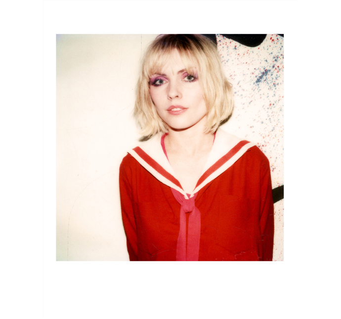
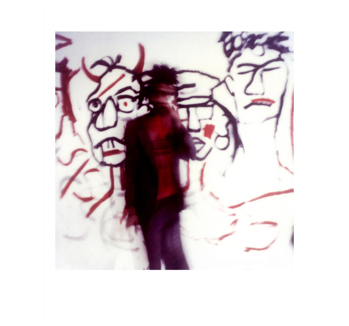
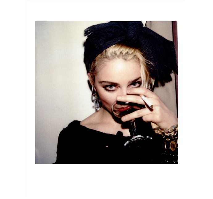
Maripol, a Polaroid artist photographer for many decades, will show some of her work titled ‘Riding the Hoods With Maripol’ in her hometown New York. Maripol, the fashion stylist and designer, is best known for creating Madonna’s unforgettable material girl look. She also had an influence on the styles of many other artists of the time, including Grace Jones and Deborah Harry. Maripol moved to New York from France in 1976, where she became a part of the New York clubbing and music scene. In the early 1980s, Maripol was the art director for hip Italian boutique Fiorucci and later opened her own boutique, Maripolitan, in the NoHo area of New York. She directed the documentary film ‘Crack is whack’ on artist Keith Haring and worked as a producer on films such as ‘Downtown 81’ starring Jean-Michel Basquiat and featuring Blondie lead singer Deborah Harry.
Riding the Hoods With Maripol – Polaroid Exhibition. Opening on Wednesday, May 18 from 6-8pm at Clic Gallery, 424 Broome Street, New York. Maripol will sign copies of her books Maripolarama and Little Red Riding Hood at the opening.
-
Hyères Alive ! Fashion Shows & Awards Ceremony
-Semi-live from Hyères, it’s Hyères Alive !
Hyères 2011 Fashion Shows.
Hyères 2011 Award Ceremony.
Directed by Antoine Asseraf
Filmed by Antoine Asseraf + Jason Last
Edited and post-produced by Clément Roncier
Voice and coordination by Lynsey Peisinger
Sound Design by Lori Schonberg
