-

MULATU ASTATKE: the bushes vs Debussy
-It may have taken decades, but the Ethio-Jazz sounds of Mulatu Astatke are now traveling throughout the world, through Kanye West samples and Jim Jarmusch films, reaching unlikely destinations such as the ecstatic crowds of Calvi On The Rocks in Corsica.
‘Doctor’ Mulatu Astatke as he likes to remind us, is not only a jazzman, but a doctor in musicology, who is eager to add to the lists of achievements of his home country, Ethiopia: coffee, inspiration to the Rastafarian faith, the invention of the musical scale, and it would seem, music conducting.
The bushes. Debussy. In the the mouth of Mulatu Astatke, it’s hard to hear the difference between the two.
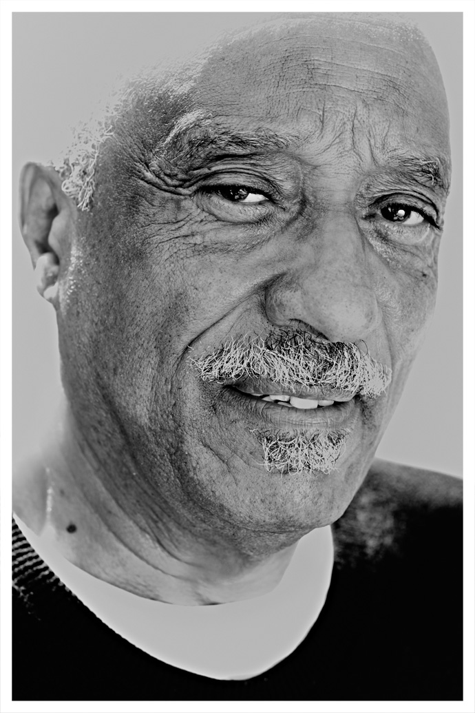
Doctor Mulatu Astatke, "Father of Ethio-Jazz" as his business Card states. Calvi 2013.
Photography by René Habermacher.
René Habermacher: How did you come to be part of this festival that is very electronic music related?
Mulatu Astatke: Well, you know, I’ve travelled to Europe a lot in the last 3-4 years. The band became very popular, very busy and we did also a completely beautiful cd which will be coming out in October for the Jazz Village. People seem to ask for my band everywhere.
I used to be involved with electronic music a few years back with Heliocentrics on the album “Inspiration Information” (2009). But I really love acoustic sounds very much: real sounds, real music, everything. It’s good for the people to be able to get both sides, they can hear the acoustic but also the electronic music. I think it’s a very good idea to bring me to this type of festival. It’s great.
RH: How do you feel about the younger generation of pop musicians referring to your sound or even sampling, as in the case of Kanye West and other heavyweights of the contemporary pop generation?
MA: I remember the film “The Broken Flowers” by Jim Jarmusch, with Sharon Stone and Bill Murray. (NB- The soundtrack to the film features an eclectic mix of music, chiefly using instrumentals by Mulatu Astatke as the main score mixed with garage rock, metal and reggae.) The film really made a push and brought different crowds to my audience.
Then people started sampling my music. So my audience keeps on growing. I love it, I have no objection to sampling my music, because every time they sample, the crowds come too.I see all kind of people in London, in Paris, in Australia, everywhere, middle-aged, young, old ages, all kinds of crowd. It helps Ethio-jazz, and also for people to see different directions of music. So it helps so much. I enjoy it. Its beautiful.
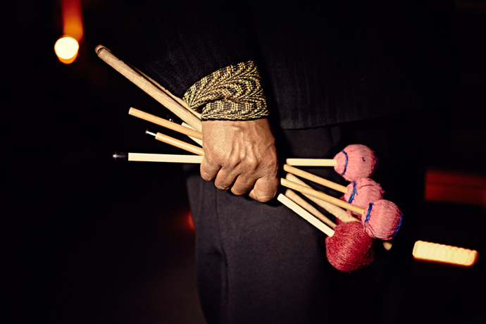
Mulatu with drum sticks shortly before going on stage. The composer’s own signature instrument is the vibraphone,
a set of graduated aluminum percussion bars that resemble a marimba or a xylophone. Photography by René Habermacher
RH: Ethiopian culture pioneered a lot of different things in music. Your work is part of that tradition.
Do you think because you were so pioneering it took quite some time for the deserved recognition to come in?MA: I put myself as an example and always say: never give up, just keep on pushing!
It’s so great when reality reaches what I always dreamed for this music to reach. If you just get to this point… it took me around 43 years!
The thing which takes time always give great results. It is what it is: as a musician you come to Paris, play Ethio-jazz, you go to NYC, to Germany, Denmark, Sweden, England: playing Ethio jazz.
And then suddenly this music just develops. Its a great recognition.I got my PhD from Berklee (NB – Boston, USA) and lectured in different universities all the time. It’s a great achievement for Ethio-jazz to be accepted at Berklee, a recognition of what we have given to the development of modern music, to dance and everything to the world. So I said: it’s not only for Mulatu, but this is a recognition of Africa, which is so great. So this is what we fight for.
Now I also do a lot of research at Harvard, at MIT and also lecturing for National Geography last month at the Royal Albert hall in London about Ethiopian contribution to culture and music.
I talk about African achievements and what it has given to the worldRH: So the theoretical reflection is very important for you.
MA: Very much! If you don’t know the historical aspect and the contribution of your country’s music, you can’t go any further.
The more you know, the more you do research, the more you enjoy.And the more you can develop the music and show to the world your own contribution.
So research is very important. For example in Ethiopia I go to the rural areas, to the bushes.
There’s one tribe, the Dirashe, who plays a diminishing scale in the middle of a pentatonic five tone scale country like Ethiopia.
In Ethiopia we play only five notes, that’s how Ethio-jazz developed: five notes against the twelve tone scale of American Jazz, you know what I mean. When I studied at Berklee, they were teaching us how Charlie Parker created the modern jazz through diminished scale. But this tribe plays a diminished scale. And great composers like Debussy are on a diminished scale. So what is really very interesting is these tribes have been there for centuries and centuries, so what I want to know is: is it Charlie Parker, was it Debussy, or this tribe ?Who was first? This is the question. These tribes people knew nothing, no painting, nothing, and they play diminished scale. I don’t know how they got it, because they are in the middle of a five note country. How did they manage to get this?
So I raised this question at Berklee and they were so surprised. What they said is: “Oh Mulatu- you got us!”
 Mulatu Astatke received late recognition: Originally supposed to become an aeronautical engineer he was
the first African student in the late 1950s at Berklee College of Music — “the only place in that time,”
he said, to study jazz. Photography by René Habermacher.
Mulatu Astatke received late recognition: Originally supposed to become an aeronautical engineer he was
the first African student in the late 1950s at Berklee College of Music — “the only place in that time,”
he said, to study jazz. Photography by René Habermacher.
RH: Is there a point where you thought the recognition is starting to come?
where you though somebody starts to understand what you were trying to do with Ethio-jazz?MA: In Europe and America, they understand and love my composition all the same. But when I went back from NY to Ethiopia, they didn’t like it at all, because they were used to this musical form that we call the current form: malalala…dalala (sings) I remember a long time ago there was a town that told me to get off stage. It was too complicated to them. They could not understand: “is this a joke or what is it?” Playing around: wabadawadawa?” – they don’t dig it. So I finished the piece and went off.
But now, after 10-15, 20 years they go crazy. The whole town of Addis is Ethio-jazz now.
Finally it’s Ethiopians! So I always say: keep on fighting, never stop. That’s the result.RH: When you worked with those tribes on interpretations, did they have any rejection?
MA: No. You know, I don’t touch them. I just work behind whatever is going on. I can write beautiful counterpoints and harmonies and they do their thing. I just tell them how good they are. What they’ve done to modern music, their contribution to the world. So they love it.
I do a lot of experimental work with this people. I do beautiful jazz fusions with them.
(NB- Mulatu once brought musicians from four different tribes together in an Addis Ababa television studio and orchestrated a cross-tribal fusion performance. This giving traditional musicians, many of them farmers, an artistic exposure beyond their tribes)
The ideal way to explore multiple forms of music is through jazz.
In fact there is a Dirashe track is on my new album, and another one with the Surma tribe.
It’s so interesting, I did an experiment with Fatou (NB- Fatoumata Diawara), the Malian singer who is featured in one song,
a fusion of their music with Ethiopian: east meet west. It’s so beautiful, its on my new album called “Sketches of Ethiopia”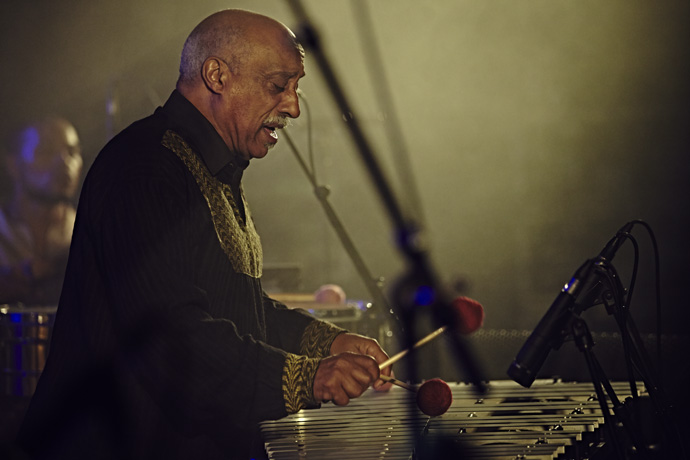
Mulatu in action at Calvi On The Rocks, Corsica 2013. Photography by René Habermacher
RH: Another culture that strongly relates to Ethiopian heritage is the reggae culture, yet in a very different way.
How is your relationship to this?MA: I really respect them for introducing the Ethiopian, the flags and their love to Ethiopia.
But even though musically we’re in different modes, different scales, different things. When you hear Bob (Marley) and the other ones they use mostly their own stuff.
So actually its not like Ethiopian culture or Ethiopian music, but this is their own way of appreciating music. I like them for promoting our country, for promoting our flag in this world, and for it to become like part of national art. We enjoy them, we love them so much! And now, you see they are adding a lot of Ethiopian modes, Ethiopian scales to reggae currently. There are rastas living in Ethiopia in a place called Shashamane.
Hailee Selassie gave them the land in 1948, so they stay there. And now they start to come into our music: Ethio reggae you know.
But now there are more young Ethiopian musicians, they do a lot of reggae. It’s great I think.RH: In 2008 you premiered a portion of the Saint Yared opera at Harvard.
Are you continuing on that project?(NB- The Saint Yared Opera is a project on Saint Yared who is regarded as a saint of the Ethiopian Orthodox Church and credited founder of the Ethiopian Coptic Church Music. He is believed to have been the first to write musical notes, centuries ahead of Western civilisation, and use an ancient form of conducting stick. The composition of the opera will blend the old and the new, and incorporate traditional chant texts in Ge’ez, the Ethiopian liturgical language, but as well electronic elements)
MA: Oh yeah. Thats very interesting. It’s gona be completed very soon. It’s already done actually.
The problem is that l am so busy travelling with other projects: I write for films, I do my experimental works.
I need two to three months to finally put the opera on a stage.This is a work I’ve done at Harvard.
My paper was about conducting being an Ethiopian contribution to the world.
We used to conduct music in the 6th century, with a stick called a mekwamia.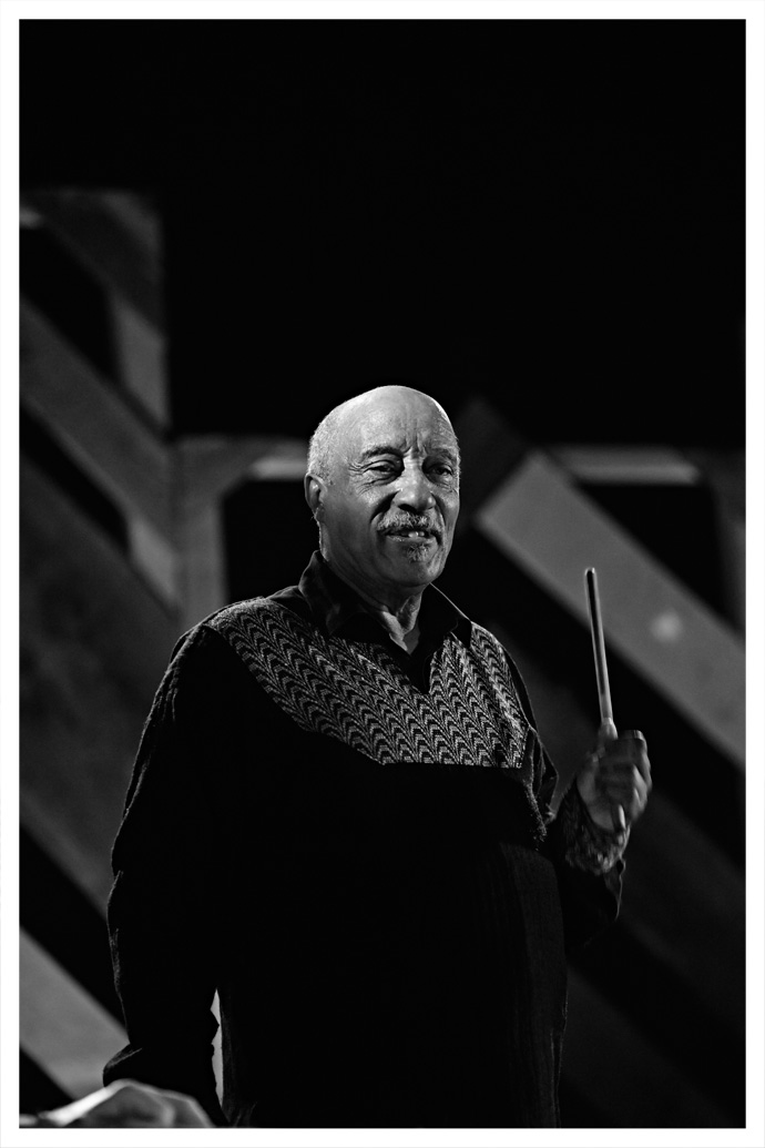
Mulatu at Calvi On The Rocks, Corsica 2013. Photography by René Habermacher
So I studied the movement. If you look at the military band march, and the man in front waving sticks and things — 80-90% of that movement is from the mekwamia in Ethiopia.
But where did they get this from? This was before existence of symphony or conducting a symphony — and we have it. If you look inside the Encyclopedia, were there symphony orchestrae in the 6th century? There weren’t.So I said “OK, there were no symphonies, so then the conducting movement is taken from us.” Of course there were a lot of conducting, there were choirs in Europe of all kind.
But the most of the movement is what they use for the military also. If you use in the symphony a stick like this, the way you move it is exactly the same how we move it.
So they are telling us “you can do your reggae, you can do your jazz, you can do your rap.”
But they say classic music is purely European culture, which Africa has nothing to do with.
They are musicologists for Harvard, Yale, Princeton – so I said:
“look, I am open minded. This is what I found. If i am wrong, tell me, I am learning from you.”They couldn’t answer me.
So I say: “one for Ethiopia”. They said: “we’ll see.”[In the opera] there are two great conductors in the symphony, one european with a bow tie, conducting the symphony behind, and a church guy that conducts the choirs.
My dream is to do it in Lalibela (NB- one of Ethiopia’s holiest cities, famous for its monolithic rock-cut churches), the cave.
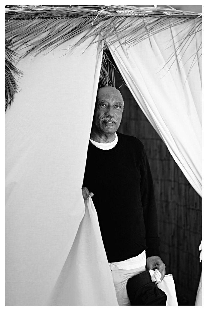
Mulatu at Calvi On The Rocks, Corsica 2013. In the late 1960s he had returned to Ethiopia with
the first Hammond Organ and Vibraphones. Photography by René Habermacher
RH: What is the last thing that stimulated you?
MA: That’s really these people in the bushes. They inspire me so much. I have very great respect for them. The more you go closer to them the more you find them so interesting. They have created so many great musical instruments.
Now there are instruments in the bushes they sound like trumpets but made from bamboo. Strings, sound like violins, cellos, that kind of thing.
So I was wondering, let’s do a research – who inspired who ?
When you see these people never had a chance to go anywhere, they have no television, they have no radio, – they have nothing.So I always think they inspire the developing world. Those are the people that inspire me. The more you go everyday, you learn something.
New ideas, something interesting from those people. They inspire me.We call them backwards. But they’re not backwards people to me, they are advanced people.
They are ahead. So this this is my life now. I listen to them.
Whenever I have the chance I am in the bushes, I go close to them.
It’s so interesting, so beautiful. That is what inspires me truly.
Upcoming concert dates:
AUGUST 10 – Paris, Trianon00 -
THE OPPOSITE OF GLOSSY
-“Nobody wants to invade Marseille” claims Rudy Ricciotti,
architect of the MuCEM.And yet everyone is flocking there since the Museum of Civilisations
of Europe & of the Mediterranean, dubbed MuCEM, opened its doors just weeks ago, the first national museum to open in the Phocean city, a project 11 years in the making.Having shot & directed the introductory ad campaign for this new institution, The Stimuleye introduces you to the man who designed it, a man as famous for the fights he picks as the building he designs.
Exclusive photos by René Habermacher.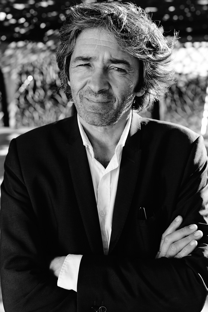 Portrait of architect Rudy Ricciotti by René Habermacher.
One side is the Fort Saint-Jean, linked to the city by a pedestrian steel bridge. A fort not unlike the Bastille – a bastion to defend Marseille against itself – the Fort Saint-Jean had been closed to the public for centuries.
On the other, also connected by a massive steel bridge, is Ricciotti’s creation, facing the Mediterranean Sea.
Refusing “architectural bling,” Ricciotti chose to have the new building dematerialize itself to complement the Fort Saint-Jean.No reflections – leave it to the sea.
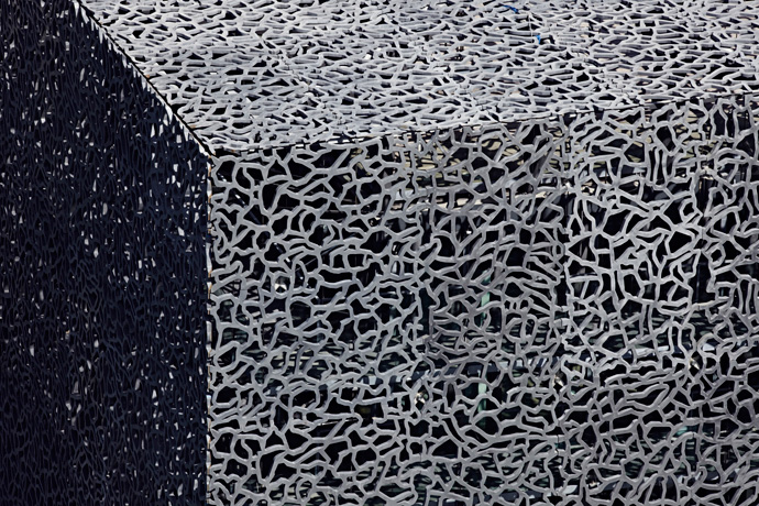


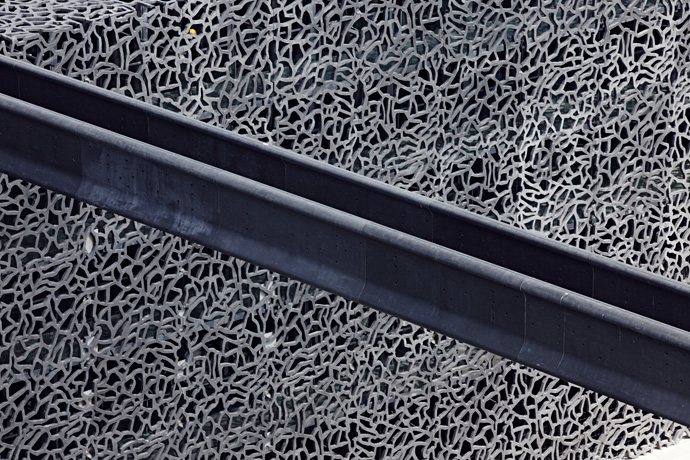
 The concrete filigree lace of the MuCEM, a second skin like a screen that allows views, light and air
to pervade the space. Photography by René Habermacher.
The concrete filigree lace of the MuCEM, a second skin like a screen that allows views, light and air
to pervade the space. Photography by René Habermacher.
TV spot for the MuCEM's launch, directed by Antoine Asseraf with SayWho and Agence White.
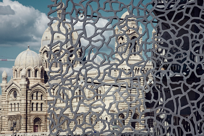
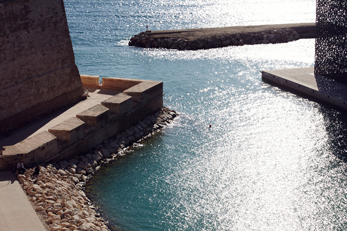
 The MuCEM's a porous monolithic body planted on pier J4 in the Mediterranean sea, connected to the Fort Saint-Jean
with a 115m long slender pathway made of massive cast iron. Photography by René Habermacher.
The MuCEM's a porous monolithic body planted on pier J4 in the Mediterranean sea, connected to the Fort Saint-Jean
with a 115m long slender pathway made of massive cast iron. Photography by René Habermacher.
Antoine Asseraf: Can you elaborate on your theory of world being split between two sides, matte and shiny ?
Rudy Ricciotti: Shiny is conceptual distance, reason, power and self-assurance.
Matte is frontal narration, intuition, defeat and regret.
Pick your side… I did.AA: Mediterranean is a concept going beyond “local” but stopping short of “global” — how do you situate yourself, and the building, within that notion ?
RR: The South is a travel certificate, not a birth certificate.
The inhabitants of Munich are more mediterranean than those of Grenoble.
The Valais region in the south of Switzerland more latin than the Vaucluse in the south of France, etc.
The MuCEM is mediterranean through anxiety and existential difficulty.AA: What is your relationship to monumental architecture ?
RR: You are talking to me, you fucked my wife ?


 Top left: "Notre-Dame de la Garde" looming over Marseille and the the seven-level, 40 000 square meter
structure of the MuCEM. Photography by René Habermacher.
Top left: "Notre-Dame de la Garde" looming over Marseille and the the seven-level, 40 000 square meter
structure of the MuCEM. Photography by René Habermacher.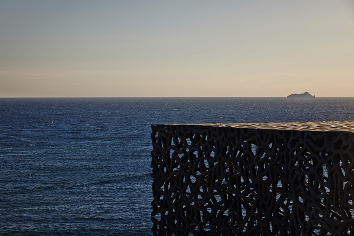

 As massive the volume of the MuCEM may seem at first, it is the use of negative space that gives the building
the air of the metaphysical. Photography by René Habermacher
As massive the volume of the MuCEM may seem at first, it is the use of negative space that gives the building
the air of the metaphysical. Photography by René Habermacher
AA: What is the last thing which stimulated you ?
RR: A fish soup made by my partner…
Read my last pamphlet to smile:
« L’Architecture est un sport de combat » [Architecture is a combat sport], edited by Textuel.With SayWho & Agence White
-
hyères just a taste…. Marc Ascoli
-“Fashion goes out of fashion” says veteran creative director Marc Ascoli.
A jury member for the upcoming Hyères Fashion + Photography Festival, Ascoli is known as the man behind the image of Yohji Yamamoto, Martine Sitbon, Jil Sander for many years.
He knows the times change, and yet the thirst for creativity is never quenched.
Here’s a taste of Hyères. Marc Ascoli at the Hyères 2012 jury selection, by René Habermacher.
FILEP MOTWARY/UN NOUVEAU IDEAL: What makes a young designer interesting in your eyes ?
His/her sensibility before anything else, that he/she has something to say. But also the degree of creativity, the ability to show he/she doesn’t fit the mold or follow established models.
A young designer, to be interesting, needs to reflect his era and talk about the times.
MALI/SKATTIE: Once you’ve started working with a brand, what is your degree of involvement and counseling?
It really depends on the intensity of the relationship I share with the person. Today the difficulty is to know which direction a brand wants to go, how to express its singularity.


Marc Ascoli + photographer David Sims for Yohji Yamamoto.
MISHA/TOKYO FASHION DIARIES: Today, it seems essential for a designer to have a public persona. How does that affect you ?
The current situation is ambiguous. Designers are personae, they embody and diffuse the image of the brand. Taking into account the investments made by fashion houses in terms of publicity, designers have become true flag bearers.
But that’s where the error often lies, to hire people gifted in public relations but much less in terms of style.
Today there is a “bottom line” in fashion, people tend to look at things commercially. Does the buzz which personality give off equal the quality of the offering ? The question today is primordial. [In the case of] Sarah Burton for Mc Queen, we don’t see a flamboyant personality, but everyone is floored by her work.
Even though it’s a time of crisis, everything is about competitivity. Considering the number of collections (men’s, women’s, pre-collections), it’s about standing out through quality not only personality.
RENÉ / THE STIMULEYE: What is the role of the stylist in the creation of a fashion image ? How did the evolution of this role impact the role of the artistic/creative director ?
There’s now a lot of confusion between stylists and artistic directors, but I believe the two have very different roles. The artistic director works on the long term image of the brand, its DNA and visual impact, whereas the stylist reflects the brand’s fluctuating image by styling the clothes, whether it’s for ad campaigns or a fashion shows.

Marc Ascoli + photographer Craig McDean for Jil Sander
BRUNO / BRRUN: Does fashion have a political role beyond aesthetic and function ?
Fashion takes place in a different universe. It’s a universe where you’re bringing something else to reality, where there is little concern for politics, because it’s all about creation and individuals.
You can see today that there is a huge gap between fashion and the political reality of our times.
Fashion goes out of fashion; fashion is irrational so it can’t be political.ANTOINE / THE STIMULEYE: When and how does a creator, singer, artist need to work with an art or creative director ?
An artist always needs an alter ego with whom to exchange ideas, to help write his/her story. It’s not just a matter of positioning. The artistic director has to be sensitive enough to understand the artist’s universe and then catalyze it ; establish an image visually and eventually commercially.

Marc Ascoli + photographer Nick Knight for Martine Sitbon.
What is the last thing which stimulated you ?
Being a very curious person, I am constantly stimulating my creativity through various cultural activities. The exhibit of Madame Grès curated by Olivier Saillard at Musée Bourdelle really seduced me. Everything was in its place, the location, the clothes, the spirit.
I was also very stimulated by the latest Comme des Garçons fashion show. I thought it was majestic.
-
An artist should not make himself into an idol
-Marina Abramović is everywhere lately.
A marathon performance at MoMa, another retrospective in Moscow, on the cover of POP magazine, hosting a star studded event at Jeffrey Deitch’s MOCA in LA and an exhibition at The Serpentine Gallery slated for 2012, the HBO documentary “The Artist is Present” just screened at Sundance. An ever growing list of projects that is taking her across continents…
Exclusive long form of interview first published in POP magazine FW2012
 Marina Abramović with her "Mini Me". Photography by René Habermacher for POP magazine
Marina Abramović is everywhere lately. She has emerged from what was considered an alternative section of contemporary art, Performance Art, to finally occupy an untouchable position in the Pantheon of Pop.
A marathon performance at the MoMa, another retrospective in Moscow scheduled, and an exhibition at The Serpentine Gallery slated for 2012, day and night filming of an HBO documentary and an ever growing list of projects. Marina is known for her works in which she tests and pushes her emotional,mental and physical strength, but her schedule takes its toll: Marina is exhausted.
Broad recognition has come comparably late for Abramović, who was often categorized as some sort of Exotic Serbian Vixen. Nevertheless, she has shaped a significant slice of art history like no other.
Today, less considered for her public sexual identity, and more appreciated for her timelessness and her bravery, one could unarguably call Marina “the diva of contemporary art”, were she not so grounded. Freja Beha Erichsen with her "Mini Me". A collaboration by Marina Abramović for POP magazine
Photography by René Habermacher
Freja Beha Erichsen with her "Mini Me". A collaboration by Marina Abramović for POP magazine
Photography by René Habermacher
Our conversation takes place just after Marina’s return to New York from Manchester, England where she spent six weeks collaborating with Robert Wilson on a new biography, “The Life and Death of Marina Abramović”. The play was staged with accompanied music written and conducted by Antony (of Antony and the Johnsons) and narrated by a ferocious Willem Dafoe.
The audience witnessed him meticulously rummaging through the details of her life chronologically. Marina has been clear about her lack of appreciation for theatre as a concept and this play marks a sharp departure from her concept of herself as a performance artist.She participates in what she used to essentially despise: “To be a performance artist, you have to hate theatre. Theatre is fake: there is a black box, you pay for a ticket, and you sit in the dark and see somebody playing somebody else’s life. The knife is not real, the blood is not real, and the emotions are not real. Performance is just the opposite: the knife is real, the blood is real, and the emotions are real. It’s a very different concept. It’s about true reality.”
 Death mask of Marina Abramović. Photography by René Habermacher
René Habermacher: With this piece you staged something that you call artificial theatre. It lacks the realness that is central to your work. How was this experience for you?
Marina Abramović: I am his material. I completely gave all the control to Bob (Robert Wilson). That is the only way to really be material for someone else, which is very interesting, because its just absolutely the opposite of what I do. This is first time that i have this really radical approach with Bob – he absolutely refused anything to do with performance. This was an amazing experience for me and very difficult, because his approach to rehearsal is like mine to performance, – but yet it’s just rehearsal! Just be there for hours and hours in order for him to fix the light. I lose my reason, I need the public, I need another kind of dialogue. This was a huge discipline not to kill him!
RH: How did this project with Bob come together? (more…)
-
THE BERG SANS NIPPLE
-‘Build With Erosion’, doesn’t pertain to any set form or principle. It’s a challenge: a deeply experimental and infectious third album from The Berg Sans Nipple, combining devastating melodies and a mind bending rhythm section informed by disciplines as diverse as gamelan, dancehall and DC Hardcore. THE BERG SANS NIPPLE is Lori Sean Berg and Shane Aspegren.
 Lori Sean Berg and Shane Aspegren jamming on a cloudy day in Paris. Photo by René Habermacher
What was the last thing that inspired you?
S: That’s a hard one to answer. As time goes on, it’s a lot harder to be really be blown away by things. We just did the project with Le Musee Du Quai Branly in Paris and had the chance to dig through their audio archive. This was really refreshing to work on to discover new sounds from around the world. Also, Lori and I saw the Anish Kapoor installation at Le Grand Palais together and that was really amazing. It was something that you needed to spend some time inside to appreciate the full effect. I suppose we like things without immediate gratification.
Can you remember a particular inspiration for your latest album BUILD WITH EROSION?
S: The record was created over such a long period of time that there were so many things that were poured into it. In the end, the theme of erosion was really important.
L: We use a lot of eroded musical equipment. I’m not sure how to say it? We love dust!
S: In a way it’s always been a theme of the band… using instruments that are on their way out, or loving the sounds that came from pedals with dying batteries…
 THE BERG SANS NIPPLE in action. Photo by René Habermacher
Is the concept of “erosion of instruments” something that interests you conceptually or is it the frailty of sounds created?
S: I guess it’s both of those things. There’s always been a balance of harshness and beautiful sounds in there. Also, lyrically, it all ties in together, but that’s all there for people to digest as they’d like.
L: I love instruments on their last legs. I want to give them a second life
Tell us a little more about why you work with concepts. In advance of the album release, you set up a site for BUILD WITH EROSION incorporating the surrealist concept of the exquisite corpse. You used this concept again for the promotional video for Change the Shape. Why?
The Berg Sans Nipple – Change The Shape from Clapping Music on Vimeo.
S: A band that I was part of back in the late 90’s used to make exquisite corpses in the van on tour and, at that time, I was really into the Surrealists. I’ve always wanted to do a project like that and it worked really well with the “Change the Shape” theme. It also gives a different energy to a project when you can get a bunch of other artists involved.
L: Although “Build with erosion” is not a “conceptual” album…
S: Maybe not conceptual in the sense of advance planning but, in the end, it developed into a unified concept. Things become what they are and it all makes sense together.
 Lori Sean Berg of THE BERG SANS NIPPLE
One of my favourite tracks on the album is DEAD DINOSAURS RULE THE EARTH. How did that track develop?
Dead Dinosaurs Rule The Earth – The Berg Sans Nipple by blackmaps
L: From Zari!
S: Of course, the title came from my daughter and I jotted it down in a notebook. We had a bass line and drumbeat in a tape full of improvs that we had done together and I thought that the title was perfect for the bass line. As always, it went through a lot of transformation to get to the end of that track, but it all stemmed from a child’s mouth and an improv.
L: An old old idea. Probably recorded from my minidisc.
S: Yep, that wasn’t one that we created from opposite sides of the world. Apart from the lyrics, it was worked on in an old fashion style, when we were together. I think even all of the kalimba lines were from that minidisc!

Lori, you live in France and Shane, you live in Nebraska. Do you work together while living apart by exchanging ideas or do you tend to do most of the work in the concentrated periods when you are actually together?
L: We really need to be together for “the moment “. But maybe we could do a conceptual album through skype next time?
S: It’s really combination of the two. The best stuff comes out in the concentrated periods of being together though. The brooding and frustration comes at the other points, but then gets weeded out when we meet up again.
L: That sounds agonizing. But when were together we have a lot of fun, we play pinball and drink wine and champagne.
S: visit caves…
L: and meet cavemen…
S: Cro-mags from the perigord noir!
 Shane Aspegren has a fable for unusual soundtools..
The Berg Sans Nipple is known for its amazing live shows. How do the two of you go out there and recreate the complexities of your sound?
S: We started as a live band. In fact the first few shows we did, we never repeated any of the music that we made, but were really just writing a set of music to perform live. Now thing are a lot more complicated in that we’re writing in the studio and then trying to figure out how to transform that into a two person live setting. I love both sides, but it’s become more challenging as things have evolved.
L: It’s always a “casse-tête chinois” when we play shows! I think it would be much easier for us to simply work in the studio. But it’s important for us to play live music… to be connected with people.
S: We’ve always tried to make a connection between each other, even through sampling each other live and setting up face-to-face. I think that was our first goal in playing with each other. So the idea was the inception of the band. And hopefully that’s how we connect with our crowd.
 ...and malt brew
You both work outside the band, including work in film and photography. Do you have any favourite photographers or visual artists?
S: I have a hard time pinpointing favourites of anything. I was really into Robert Frank and Duane Michaels and photographers like that when I first started taking photos, but there’s a lot to love about so many things. I like colour a lot more now. But speaking of visual artists, we’re really lucky to have been working with Cody Hudson and Stephen Eichhorn (who were responsible for the artwork for “Build with Erosion”).
If THE BERG SANS NIPPLE could work with anyone who would it be?
L: Johnny Cash.
S: That’s interesting. I feel like it’s always the thing that’s the most exotic that interests both of us, which is maybe why the trans-atlantic game works for us. I’d probably say that scoring something with Ennio Morricone or maybe even moreso, Bernard Herrmann. It wouldn’t necessarily be a film though… maybe something in a public setting. Or we could score Johnny Cash’s life.
In what direction do you see THE BERG SANS NIPPLE developing into in the future?
L: Pinball sound design. That is the future for me!
S: If Lori is going to go off on his own to get lost in pinball world, then I guess that it’s, the end! We’re trying not to focus too much on the future but to work on the present as much as possible. We’re starting to do a lot more film work together and that’s what we’re really interested in. I don’t see us ever stopping making music together, but we’re also ready for another step into other things. We’ve got another project in the works as well… a new record with a different concept that won’t necessarily be the BSN, but will still be in the same spirit.
The Berg Sans Nipple – ‘Build With Erosion’ by blackmaps

-
MAX SCHELER: from Konrad A. to Jackie O.
-The exhibition “From Konrad A. to Jackie O.” at the Willy-Brandt Haus in Berlin will show for the first time a cross section of the work of Magnum photographer Max Scheler. On display throughout June and July are 140 images that document the distinct view of this artist who preferred to stay in the background. From this intimate eye-level position, he witnessed his time and documented its events with impeccable framing and allure.
 USA, 1963, Washington, John F. Kennedy and Jacqueline Bouvier Kennedy receive the Moroccan king Hassan II
© Max Scheler Estate, Hamburg Germany
USA, 1963, Washington, John F. Kennedy and Jacqueline Bouvier Kennedy receive the Moroccan king Hassan II
© Max Scheler Estate, Hamburg Germany
I remember Max Scheler with one of his beloved Davidoff cigarillos smoldering away nearby. He was an impressive character, with an elegant dryness that one would be tempted to account being Hamburgian, yet he was born a boy from Cologne. In his later years Max had dedicated his time entirely to taking care of the Herbert List estate – the iconic work of the photographer who shaped and mentored him. On one of my visits to the archives we went through folders and boxes of photographs and came so across prints of Max’ work for the first time, almost by accident. I had not been aware of his photography then, though i knew he had worked at Merian and founded the magazine GEO at Gruner & Jahr, introducing colour reportage to the wider audience.
I’ve talked with co-curator Olaf Richter, head of the estates of both Herbert List and Max Scheler about Max, his background and the relationship to Herbert List and the current exhibition
RENÉ HABERMACHER: How did this exhibition come together- and why right now?
PEER-OLAF RICHTER: The idea of this show was born in February 2003 – the month Max Scheler died. It took us about 6 years to finish this project. Why did it take so long? Max Scheler was humble if not neglecting his own work. He stopped working as a photographer in 1975 and since then had turned the tables. He rather worked to publish other photographers work, than his own.I took quite a bit of effort to rediscover what was going on in his life as a photographer. The negatives from the late 50s until the mid 70s were in a rough chronological order, but before that, the first 8 years, were all over the place. For us the first period was especially interesting, because it told us something of where he was coming from. He learnt photography from another photographer: Herbert List.
Herbert List printed the images that he considered important. The Estate had a rich base of vintage prints that covered all the projects he worked on in his life time. These prints were frequently titled on the back. The main books on List that had been on the market had all been made with these prints as a basis.
For Max Scheler things are very different. There is not that much vintage material, and it is hard to say if these old images reflect his personal choice or some editors preference. So we went back to the negative and contacts and researched there. Unfortunately the negative have only a rough labelling, and therefore it took a lot longer to make a selection, research locations and titles.
Max would always put Herbert’s work ahead of his own – which was something that I never understood. Why this hesitation?
I guess he felt that his work of that period, was the work of a pupil, while the work of his teacher, was really what was worth remembering. It is interesting how close the two worked together. After an initial year or two as an assistant on the road and in the darkroom, Scheler started getting his own assignments, gained some respect, moved from Munich to Paris, met Robert Capa and even became a junior member of Magnum.
How did the relationship of the two evolve after the first meeting during war in Munich: personally and professionally? I am also asking that as I have a special interest in the idea of the “stimulating” mentor.
I guess stimulation needs at least to prerequisites. At first the receiver of the stimulus needs to be in a situation of wanting to open up, receive a certain change in her/his perception and possibly even her/his life. And the stimulus must also be desireable and fit the pattern of interest of the receiver. If the stimulus is too foreign or threatening it might be rejected. I think these things fell in place when Max Scheler met Herbert List.He was very young then- it must have been the shaping experience…
Max and his mother left Cologne in 1941, when Max was 13 or 14 years of age. Around the same time List left Athens, because Germany invaded Greece. He had tried to immigrate to the USA but failed and had to return to Germany. Max was raised without a father, since he died the year Max was born. The sudden presence of a male person of authority in the life of Max and his mother was quite welcome. Not to be misunderstood all three of them were very liberal, unconventional and forward thinking persons. None of them wanted to construct a classical family. It was more the realisation of his mother that this very sophisticated photographer in his forties did spark some certain interest and outlook in the young max’ life, that she possibly could not, because the was too close. She of course realized that he was gay and therefore no husband material. But she might have also understood that the conventional reaction of a mother to not allow her son to have contact to a 25 years-older gay man, would have been rather short-sighted.
So through the turmoil of the war they kept close contact.
The stimulation we talked about earlier, that caused Max Scheler to learn a craft, languages and a certain ‘savoir vivre’ from Herbert List, developed through that time.
And I think that it was manyfold. I am not sure if photography was really the most potent influence here. And I am not sure what was going on between the two of them emotionally. Did they fall in love? That is speculation, but I guess it safe to say that a certain amount of love and trust is necessary to allow oneself to be stimulated.
(more…) -
ERWIN BLUMENFELD: through the eyes of his son Henry.
-On the second day of the fashion and photography festival in Hyeres, I watched Henry Blumenfeld, elementary particle physicist and son of Erwin Blumenfeld, inconspicuously walking through the exhibit of his father’s work at the Villa Noailles. He was wearing a tan suit, sneakers and a baseball cap that was slightly crooked on his head. Before long, the spacious, bright room where the artist’s photographs and videos were being exhibited became empty and quiet. Only the slight hum of voices around the villa could be heard through the walls. Here, surrounded by a collection of stunning and rare examples of his father’s work — large-scale, restored prints — Henry sat down with us for an intimate conversation: Erwin Blumenfeld the artist, the father, the mentor and the man of perseverance.
by Lynsey Peisinger, Photography René Habermacher
 Son Henry Blumenfeld in front of his fathers DOE EYE with Jean Patchett for Vogue US 1950
LYNSEY PEISINGER: Where were you born?
HENRY BLUMENFELD: I was born in 1925 in Zandfoort near Amsterdam. My father had been an ambulance driver during the first World War. During the war, he had met my mother who was Dutch, Lena Citroen, who was a cousin of Pal Citroen, a German/Dutch artist. He grew up in Berlin with my father and they went to school together and they were very close friends. Through Pal, he met my mother and they corresponded during the war. My mother came to visit him in Germany when he was a soldier there. He tried to leave Germany, but he couldn’t. So, just after the war he came to Holland and then, a little bit later, married my mother in the early 20s. I guess, 1921. And because he was German and she was Dutch, she became German — that was the Dutch law at the time. I was born in Holland, but because I had a German father, I also became German.
LP: What was your father doing at that time?
HB: He was surviving. Leaving Germany at the end of the war, he tried to survive with the help of my mother and set up some kind of art dealing business with a friend, but that didn’t work very well. He was doing a lot of collage and kept in touch with other German Dadaists. After two years, he started to work as a clerk in a department store. Later, around the time I was born, he opened his own shop called the Fox Leather Company, selling ladies handbags and suitcases on the Kalvestraat. That went fairly well, but soon Hitler came to power and the business went badly and eventually bankrupt. That’s when he decided to become a photographer in 1934.

 ERWIN BLUMENFELD Exhibition at the villa Noailles Squash Court. Right: Erwin Blumenfeld OPHELIA 1947
RENE HABERMACHER: So your father’s first art oriented interest was collage and he was in the Dadaist movement?
HB: He was already interested in photography. He got his first camera when he was about 6 or 7. But his main interest was perhaps the theatre. That was something he was strongly attached to: the German language. His Dutch always remained a little bit feeble to say the least. He worked quite a lot, but with theatre in German language, he couldn’t make much of a living… With his collages he couldn’t make a living with that either but always kept in touch with the Germans — Grosz and Richard Huelsenbeck and other people of the Dadaist movement. Recently there was an exhibition in Berlin on this periods work of my father and a book has been published.
LP: Did he continue to do collage later on when he started doing photography?
HB: No. When he was doing collage, he was also painting — he was a Sunday painter: He did quite a bit of painting on Saturdays and Sundays. But he dropped doing his collage and the painting and started doing photography in Amsterdam. The business went rather poorly, he had health problems and more or less escaped to Paris around the 1st of January 1936. The first year it was very difficult for him to make a living. He got support from the family of his wife, of my mother. On his side he didn’t have much family left. His father had died before the first world war and his mother deceased shortly afterwards. He lost his brother in the war as a soldier in the German army and his sister died of Tuberculosis shortly after.
My father was friends with Walter Feilchenfeldt’s wife Marianne. He was a quite well known art dealer in Zurich. Mariane Feilchenfeldt helped him to rent his studio in Paris at 9 rue Delambre.
RH: So in Paris he got introduced to photography on a professional level?
HB: Already in Holland he was doing it on a professional level. He took many portraits and pictures there, but they didn’t sell much. He got in touch with some French people who came to Holland and they eventually supported him when he went to Paris — like Andre Girard the painter. Then, after about a year later, he started to sell photos to small photo magazines in the US and England, such as Lilliput. In 1937, he met british photographer Cecil Beaton who introduced him to Vogue. My father started to work for Paris Vogue in 1938.
When he was in Paris, he worked only in black and white. Color was not yet really developed for photography. It was very difficult for individuals to use color in their own studios, so he only did black and white while he was in Paris. I should mention that for his Paris period, his publications in Verve were very important. He had some of his striking black and white photos published in the first issues of that magazine. In the dark room, he experimented a lot, but only in black and white.
Then came the war and during the war, we were foreigners in france — we were not really refugees, but were without status, so it was quite difficult. In the beginning of the war, we were more or less exiled, we lived in a hotel in Vessely nine months, a sort of medieval town in Burgundy, France with a really nice cathedral. Then the Germans came and my father and sister were put in a camp. My mother and my brother and I, with the help of some Citroen cousins, managed to escape to the south of France. Our father was then in a rather horrible camp in France. We stayed in the Country until 1941, trying to get out. Then we managed to get a visa for the US — my father had been to the US already, in June of 1939. That was were, I think he took his first color photographs. He came back to France in July 1939 and he was stuck in France for two years. Then when we got to go to the US, he started working first with Harper’s Bazaar for two or three years, switched to Vogue and started doing color photography. At the time, he took his color pictures in the studio, using different color lights and so on — he was very experimental. But for the development and the printing, it was completely out of his hands. It was always done by Kodak. At the time, he couldn’t do anything in color on his own in the laboratory.
Most of these photos here were printed by Kodak. When I say printed, they weren’t really printed, they were large color transparencies. Like big negatives — 12 by 15 inches. I think that all of these photos here were taken in this large format and they were transparencies. The pictures were only printed for Vogue — working from the transparencies. Sometimes my father would give some direction on how they should be printed, but he was not generally involved in the printing itself. Only later, around 1956, they started to develop a new process called C-Prints. He bought the C-Print machine and he could start doing his own color. But C-Prints were very unstable as far as the color went — if they were exposed to light, in a few days they would essentially vanish. So all of his work in C-Print is essentially gone. Even the color transparencies that we have of his work have either faded or changed color a lot. Especially the reds, had faded. So, our doughtier Nadia has worked a lot with Olivier Berg at a laboratory in Lozère to try to restore the original colors. She is using the original publications because those prints have kept their color much better than the transparencies. So what you see in this exhibit is the result of the work that Olivier Berg and Nadia have done.
RH: Would you say that your father was somebody who was very progressive and pushing for new things in general?
HB: I don’t know about new things…. He was for the experimental, which is a little bit different. I don’t know if he was really striving for new things, but he tried to do do things differently and experimented. He was very much inspired by especially old painters like Goya and Renoir and much impressed by Picasso. I don’t know if he ever got to meet Picasso in Paris at the time. But he met quite a few artists as Dali and others.
 Erwin Blumenfeld advertising for PALL MALL circa 1957.
RH: But he liked the experimental, so maybe that was something that remained with him from the Dadaist movement?
HB: Yes, that was important to him.
LP: I heard Michel Mallard talking earlier about how remarkable it is that there was no photoshop or digital editing at that time… this image, this one with the lips and the eye, DOE EYE, where the nose is missing and there is color separation, was this done in the retouching process?
HB: This was done in the process of retouching. It was an original black and white picture. It was colored afterwards by my father and by Vogue. They worked on it together. That was a special case because the others that you see were done in color and then reworked. This one did not originally have these colors.
RH: When your father was working, did you often witness his process and how he worked in his studio?
HB: No. When he was in Paris, working in black and white, I was somewhat present. But afterwards, in the States, I was not really present anymore. So I didn’t really witness him working in color.
RH: Was his approach as a photographer more controlled or more spontaneous?
HB: I think both. He was quite controlled — all of these pictures here were taken in a studio. But he also traveled quite a bit in America and in Europe and he took many 35 millimeter color slides. Incidentally, the color of those slides kept much better than the color on the transparencies. But, in the studio, he was very controlled and would take many pictures to get something specific in a sitting.

 Left: Erwin Blumenfeld LE DECOLLETE 1952, RIGHT: Henry Blumenfeld in Conversation
LP: In Paris, were you present when he would shoot people in the studio?
HB: Sometimes, but not very often. I was more present when he was working in the dark room.
RH: I recently saw notes from Richard Avedon where he had a black and white print and he marked on it all of the places where he wanted the development to be darker or lighter using manipulation techniques in the dark room. Was your father working with these techniques too?
HB: Yes in the dark room, for black and white, he manipulated a lot. It would have been interesting to see what he would have done with color photography if he had been born fifty years later. At the time, the technology wasn’t there for him to do anything after a picture was taken in color.
RH: Where would your father have his intellectual and creative relationships — in other photography or painting etc?
HB: I would think painting. Very much painting, classical painting. Many of his photos were inspired by different painters. He was also inspired by modern life and by life in NY at the time, in the 40s and 50s. He liked jazz music very much, in the New Orleans style.
And he was quite interested in looking at television when it first came out. We got our first television set around 1950 or so. It was black and white at the time. I don’t think he ever saw color television. Maybe he saw it, but he never had one. He liked movies — but more for the content than for the photography. He liked Nanook of the North, about a Danish explorer. He was interested in movies — liked Erich Von Stroheim and he liked Sunset Boulevard and Billy WIlder.
RH: Was that love for cinema also what led to him making films?
HB: The filming was more in line with advertising. I think he was trying to see if he could use the filming for advertising, rather than to tell a story like in movies. Now you see everything mixed, advertising and movies. But at the time, it was an experiment.
RH: Do you think that your father really divided the things that he did for himself and the things that he was commissioned to do? The time after the war was quite commercial driven in America — was it easy for him to also do what he wanted to do?
HB: For one thing, the black and white and the color were two different things. In black and white, he could do what he wanted. In color, probably none of them were published in the exact way that they had been taken. They were made and developed specifically for Vogue. He did appreciate the possibility to work in color, but the whole fashion business and the way it worked was not very attractive for him. But still, when he had started out in Germany, he had started out working for a textile company and so, even then, he was interested in materials and fashion. Still, he didn’t really appreciate the fashion magazine business, but he knew that he could make his living there. So there were two sides to it for him — on one side, it was a place for him to make a living, on the other side, it gave him the opportunity to work in color, which he might not have had otherwise. He did have certain resentments, which is true for everyone in any job.
 Erwin Blumenfeld DECOLLETEE and BLUE both 1952, and POWDER BOX 1944
RH: There are artists who suffer between the economical need to do something commercial and the desire to make the work that they are passionate about. They can feel torn…
HB: I don’t think that was his case. First of all, he did well financially in the 40s and 50s and he appreciated that. And then, because of that he was able to continue his work in black and white. You might have seen his book “My One Hundred Best Photos”. We have people comment on the fact that there is almost no fashion in that book–he did a little fashion photography in black and white for Vogue before the war, but later he didn’t do any fashion work in black and white. But, it gave him a lot of satisfaction to be able to do that book of his black and white work.
Still…he wasn’t always satisfied with everything. Becoming old for him was very difficult. It made him suffer a lot…some people accept it, but he accepted it quite badly.
LP: You said that he was experimental as a photographer. As a person and as a father, did he also have that type of attitude? And did he transmit that type of approach to his children?
HB: Well….I think he had his ups and downs. He was a very active father in many ways. He was involved with his children and either pleased or displeased with what they were doing. I don’t know….the children turned out very differently. I became an elementary particle physicist. My brother became a writer. He is not exactly politically minded… he is interested in art, sociology in many ways and in the way people behave. He was very rich in ideas my father, perhaps more so than his children.
LP: Did any of his children take an interest in photography?
HB: Interest yes, but not active in photography. Though, my wife became a photographer. She was born in Paris to an Algerian/Russian father and a British aristocratic mother. She survived the war in France — her father was Jewish, her mother was British, but anyway they would have liked to capture her. After the war she came to New York and worked for one year for the New York Times, one of the first women to work in a non-secretary position at the New York Times. Then she went back to France and when she came back to the States, the New York Times fired her because her vacation to France was more vacation than they were willing to give. Then she met the wife of Alex Liberman, the editor of Vogue, and became model editor at Vogue. Her job was to provide models for the photographers. Then she met my father and after a fews years, she started working for him. She started representing him. She never got any lessons from him in photography but she worked with him as an assistant– sending his photographs to different commercial companies. Then after we got married, she became a photographer herself and worked quite actively as a photographer. First a bit in Princeton where we lived. Then in Geneva for a few years. Then we came to Paris and she started working for Vogue and other magazines. She did mostly portraits of personalities and important political people and scientists etc. And other side projects, like children photography too. To a large extent inspired by my father. Of course, after we got married and had children, my father got another assistant, Marina Schinz. She became a photographer too — mostly garden photography and published a book on that.
LP: It is interesting that she worked with your father, who was doing a lot of fashion photography and then she became a garden photographer…
HB: She admired his work very much and when he died, she bought his studio on Central Park South. And she didn’t have a single photograph of his on the wall.
Both she and Kathleen, my wife, probably wouldn’t have become photographers without him. They were inspired by him, but they probably felt that they couldn’t really rival him, so they chose different styles.
LP: Do you think that he was a good teacher?
HB: He wasn’t really a teacher. But he was a big influence. My wife saw how he worked, but he never tried to give her lessons. Same with Marina Schinz.
When my father died, he let Marina handle his photographic inheritance. From the point of view of his will, it was never very clear…He left the photos with her and she tried to handle it the best possible way. So she divided all of the black and white photographs into four lots–one for each of his children and one for herself. Then she gave essentially all of the color transparencies to Nadia. Now Nadia has been quite active in promoting her grandfather’s work. She is now working on an exhibit for next year in Chalands sur Seine. There is a photography museum there and next year they will do an exhibit of my father’s work.

 Left: Erwin Blumenfeld BLUE with model Leslie Redgate 1952. Right: Erwin Blumenfeld VARIATIONS, unpublished 1947
LP: What is the last thing that stimulated you?
HB: What do you mean by stimulated? Something that affected me? Well, the thing that affected me is that my wife, Kathleen, died three months ago. Clearly that affected me. She had been sick, her brain didn’t work anymore. She was going downhill for ten years and in the last two years, she didn’t talk anymore. I don’t know what went on in her head. And three months ago, on the 9th of February, she died next to me…That is the thing that affected me. Also, what affected me was, she died very peacefully next to me. I didn’t realize that she was dead until I felt her and she was still warm and the kin came and said “votre femme est morte”. The morning afterwards, I got the announcement that a second great grandchild had been born. That also affected me. The day afterwards was the funeral and that was quite a moving event–we had five of the grandchildren and they made speeches and my children made speeches and I made a speech. One of the granddaughters filmed it and I now have it on dvd. So, that too affected me. I could tell you more, but maybe that’s enough for the moment.
Kathleen had been very close to my father and she admired him very much. Over the last ten years, she slowly went out of this world.
Thanks to our daughter Nadia, Kathleen had two double page spreads in Match in the last year. Nadia had given the pictures of Kathleen to Roger Viollet and he organized the spread.
RH: What is your work?
HB: I am an elementary particle physicist, experimental! Which is quite different. But I worked first with Cloud Chambers and then with Bubble Chambers and so I surely took more pictures than my father did. Of particles. Millions of pictures.
-
ATHI-PATRA RUGA: tales of bugchasers, watussi faghags and the afro-womble
-The ascension of young South African artist Athi-Patra Ruga came fast under radar of International attention.
His work, that is often characterized by a dislocated humor, is transcending the divides between fashion, performance and photography and interrogates the body in relation to society, ideology and politics, subverting the western ‘art library’ as he calls it.
The Stimuleye talks to charming Athi-Patra, who was recently featured in the Phaidon book ‘Younger Than Jesus’, a directory of the world’s best artists under the age of 33, about his work and influences.
 Athi Patra Ruga’s intervention for the X-Homes Hillbrow project with the character of ILUWANE.
Photography by Nadine Hutton
Athi Patra Ruga’s intervention for the X-Homes Hillbrow project with the character of ILUWANE.
Photography by Nadine Hutton
RENÉ HABERMACHER: Where are you right now?
ATHI-PATRA RUGA: I’m in my Cape Town studio editing my latest tapestry series and fighting my cats… simultaneously. [laughs] I’m big on cat competitions… my two Russian blues Azange and Shadofax will be taking part so we have been grooming them like crazy… with a few scratches to prove it… hehe.
You’ve just came back from a break – have you got an idea already on what to work on?
At the moment I will be spending the next year creating quietly an extensive body of work revolving around a series of portraits that I will be rendering in tapestry. I have been doing a lot of sittings with various people and doing preliminary sketches. I am editing those now to get started in the next month. I was thinking of titles to name this body or the final exhibition etc: What do you think of :…the do’s and dont’s of bodyworship [laughs]
I am very interested in the power-relations involved in portraiture… especially in response to the ethnographic history involved. I am always concerned with who or what element in the image takes more precedents/importance… the technique or the seater or the artists ego. That argument in my head leads to some lovely renderings.
Your work is known to straddle the divides between fashion, performance and many more disciplines. What is your ultimate goal?
Transcending all boundaries that have been put on who and what one should create.

 Athi-Patra Ruga's monogram and portrait photographed by Ant Strack
The monogram you use ‘AP’, seems to be derived from Albrecht Dürer?
Nice spotting, yes Dürer is the reference. A big part of the work is appropriation and ultimately subverting the “western art library”. In this case I am always interested in this “I am the one and only”, self-centric way of creating or rather I am totally disturbed by it. The logo is for Athi-Patra Ruga and studios cc. The name of my company and studio. The “and studio” part alludes to the idea that collaboration forms a big part of my practice. I would like to continue with this point.
Does Athi-Patra mean anything specific?
No, it’s a brand like others. And a brand is the highest promise of good quality and superior concept.
It’s two nicknames of my birth name. I’ve been called those names all my life really. It’s as old as I can remember.
So where does the “evil little boy”, as you called yourself come from?
Well I don’t know… I embrace my evils and vices I suppose. As to where it comes from, let’s just say there are a lot of boys and girls think so… at some points I tend to believe it. [laughs]
I was born in a Bantustan, which is a puppet state created by the apartheid government, a dictatorship. In March 1984, on my 13th birthday, Biggie Smalls died. My mom was a midwife, my dad a sports journalist. My parents were gone for long stretches of time and I had to defend myself. It seemed natural, it was one big ball of trauma. I grew up in the townships and during the strikes and boycotts. Many kids [or rather young adults] used to brutalise us for going to suburban/private schools. I spent most of my time indoors as many kids could not cope with me: I was violent in a violent time. Both at home and outside, the country was going through a revolution.
 Athi-Patra Ruga: "Idol Death Mask Series" 2009, Modeled Paper, Approx. 27cm x 23cm each
Image courtesy of the artist and whatiftheworld gallery
Athi-Patra Ruga: "Idol Death Mask Series" 2009, Modeled Paper, Approx. 27cm x 23cm each
Image courtesy of the artist and whatiftheworld gallery -
1136 postcards and a smoking nun…
-One family. One postcard for every day apart. The Butlers’ uncommon journey is told by the postcards from a mother to her daughter.
Collaborating with Dutch designer Irma Boom, Jennifer Butler has published an innovative book: JAMES JENNIFER GEORGINA, a taxi yellow, 1200 pages volume in limited editions of 999 copies, parted in three sections with a joint spine, telling a unique story through 1136 postcards and 20 dialogues.
Jennifer travelled the world with her husband James, in an effort to dry him out from his alcoholism, while their daughter Georgina stayed at home with various nannies, but Jennifer sent her daughter 1 postcard per day away – 1136 postcards written from 1989 to 1999.
205 flights taken, 268,162 miles driven, 2 bullfights.
A speeding ticket.
53 unpaid parking tickets.
13 cancelled flights, 1 bomb scare, and 205 churches visited, politics, wars, rising prices, births, funerals, holidays…
Yet what comes forward above all is their relationship.
 JAMES, JENNIFER, GEORGINA by Jennifer Butler. The 3 spine design allows to lay the book flat
We meet at the American Library in Paris, 23 years after the odyssey started.
As they arrive, Jennifer, a former model, on her side her very British gentleman James, holds a copy of the book in her hands, spiked with post-its of matching yellow. She is in full swing, mentioning another book by Allen Fletcher: “Be aware of wet paint,” he wrote in his beautiful handwriting: ‘I don’t know where I am going, but I am on my way’ and it really sums me up: I don’t know ever where I am going, but I have a sense that I am gonna get there!”.
It was in fact Allen Fletcher’s work, and particularly “The Art of Looking Sideways” that made her look differently at the value of the hundreds of postcards she had kept in boxes after 10 years on the road. When in 1999 the drinking of James stopped, so did the postcards. In 2007, Allen Fletcher was only a few months more to live, so he recommended to Jennifer to work on her project with Dutch designer Irma Boom.
 Jennifer Butler at the American Library Paris
Behind the book, says Butler, lies a passion “for extending the boundaries of what a book can be. And the knowledge that books have to be more, different than ‘information.’ More than being able to download them from the internet” she says. According to her, ‘the book’ is not in the ‘up’ – it’s in the ‘down’:
“The book remains to spread something else: maybe sheer beauty or a much slower, more thought-provoking message” Jennifer expresses in her first correspondence with Irma Boom, sharing the designer’s standpoint on book-making today.
Despite the highly sophisticated and calculated design, JAMES JENNIFER GEORGINA is an emotional matter: “The book is an extension of the content. Irma would not have designed that way for a book about tennis players, or about architecture, whatever. This book is married to the silk screen yellow that she chose, and the yellow canvas. The book is yellow because its full of light and success! […]”
“My husband, Georgina’s father, was drinking himself to death. And with one failed marriage behind me I fought to stave off a second.” James was given only two more years to live, so “to save us I took the difficult decision to leave Georgina at home. We travelled to dry James out and we travelled to shield her from the indignities of drink. Everyday we were apart I wrote to Georgina. If love waits upon a gesture, then my gesture was these postcards. I wanted her to know just who I was and just what I did. They’re a testament to a mother’s love and a sharing of advice, anecdotes, front page news and exotic places” she explains.
 Cassette with the Book of 1200 pages, sewn in yellow cloth
“The post cards were never written for public consumption. They were written because I loved doing them.
And I did miss Georgina. And I did feel guilty and it was a way, felt like mothering from a distance.”
For Jennifer, it is actually a very traditional story: “there is a situation, a lot of descriptions with the postcards of a story, there is drama and there are 3 characters. They’re just divided in a very innovative way, because the description and the situation is part 1, the drama is part 2, and the characters are in an album in part 3. Usually when you read about a family or a story or a novel it’s all in one. […] ” She continues, “when people hear the word alcoholism – you know its like a dirty word or somebody survived it. The alcoholism really gave the book its Alfred Hitchcock time element.”
Jennifer admits that there was certainly a bit of irresponsibility concerning the traveling, looking back on it:
“The structure was: let’s go. Like Thelma and Louise. And I was so excited having James sober and clean shaven! He was adorable and generous and he is so knowledgeable about Europe, its history and its wars. It was like being back in university when we were driving! And there was no drink. Because he was so excited being on the road. So it really was not just about keeping him sober. He was sober and I loved the way he was.”
 Postcard from Granada, February 10, 1996
The book is framing this story of longing guilt and salvation for a wider audience in a fresh way. Despite the 210 postcards that are printed full bore in the volume, accompanied by 400 in miniature, most remarkably, the book also features a series of conversations between James, Georgina and Jennifer: “One guideline that Georgina said, and James backed her 100% up was: there would be no editing! […] “
Irma Boom, according to Jennifer, had approached the book with an enormous integrity and much love for its protagonists had insisted “that we pose the question to Georgina in one of the conversations: what was the sacrifice made by not being there. I said: ‘oh, isn’t this fantastic, Georgina spends every night looking at them.’ My mother said: ‘this is disgusting! my granddaughter is alone a third of her life!’ – of course the people who love you tell you the biggest truths.”
“It was never ever difficult [to talk about our issues as a family]. We’re all very strong characters and I think the love is so loyal that nobody worried about sacrificing love. It was never difficult to talk about the painful subjects: most of all it’s a love story.”
< (more…)
-
NJA MAHDAOUI: strokes of liberation
-Nja Mahdaoui is one of the most celebrated living contemporary artists in the arab world. His bold and highly rhythmic work, derived from the arabic letter, is internationally renowned and can be found in ther permanent collections of the Institut du Monde Arabe, The British Museum and The Smithsonian Institution just to name a few.
It’s an exuberance of arabesque forms, a visual melody played out of his hand, that remind us of the great gestural and physical richness of action painting. Famous for his meticulous inks on parchment, this “liberated calligraphy” is worked across a variety of extremely different surfaces — from canvas, brass, wood, melamine and papyrus to skin. Though It seems like writing, it is not. It is rather an interlacing of a dialectic relationship, also found within Western abstraction.
 Naomi Campbell in Azzedine Alaïa for Numéro Magazine. A collaboration between Nja Mahdaoui and René Habermacher
I came across the work of Nja Mahdaoui the first time, while researching calligraphic styles on a project for the French magazine Numéro on a piece about Azzedine Alaïa to which Babeth Djian incited me. The visual impact of Nja’s work struck me at first sight.
Slightly intimidated by the references of the rich body of his work, I first hesitated but then thought to give it a shot, and contacted him. To my surprise he answered me instantly by email, and called me shortly after. Our collaboration was set — and we created a story of imaginary movements around Naomi Campbell as a dark gazelle, in sheer and revealing Alaïa.
But I only met Nja Mahdaoui in person two summers ago in Tunis. It was an all-embracing, hot and sultry August day that lay heavy on the city, matching the emotional state of its people.
 Nja Mahdaoui wit the first prototype of his most recent sculpture. Photography by René Habermacher
A couple of months after the “Jasmine revolution” took place, Nja arrives in full swing to our meeting at a café in sunny, springtime Paris.
He’d come with his daughter Molka Mahdaoui to work on another of his new projects, yet is consumed with excitement by the events. He reacts immediately and impulsively to the question I usually ask last on conversations for The Stimuleye: What is the last thing that stimulated you?
“Stimulated? You’re asking a Tunisian? (laughs). I don’t know if ‘stimulated’ is the word, but it’s the explosion of a generation, I’m completely into it — for us it’s the event of the century!”
 Nja Mahdaoui: "Graphemes on Arches 2", 2009, Ink on arches paper; 135cm x 135cm.
With us at the table are the collaborators involved in the process of making his latest project, a sculpture, the main reason for his trip north. Nja loves collaborations – his eyes glow while he talks energetically about upcoming projects. An energy I felt the first time I saw his bold and highly rhythmic work: “a dance of calligraphy”, with Nja as the choreographer of imaginary letters, to which he refers as ‘graphemes’, devoid of actual textual meaning:
“To a non-Arabic speaker it appears as coherent text. In fact even Arabic speakers assume at first that it’s a text with meaning. But when they start reading it they realise it is not an actual word.” he says and recalls an experience:
“It is not easy to write letters in a disjointed way — that is disjointed to not mean anything — and focus only on the aesthetic. There was a study at the California Institute of Technology in Pasadena. They connected me to a machine in order to test the levels of stress my body was under when I was writing proper words and when I was writing words without meaning. The study showed that my body was 2.5 times more stressed when I was working on words without meaning. So it is a very conscious attempt to create art. I tell people I’m not a calligrapher, but an artist.”
To me his body of work is so vibrant and remarkably innovative that I first had assumed Nja to be in his early 30’s the most, yet he was born in La Marsa, Tunisia, in 1937. As Molka, a filmmaker herself, puts it during our conversation: “sometimes i have to remind myself: Molka, you are thinking older than your own father!”.
 Nja Mahdaoui: Design for Gulf Air 50th Anniversary. Image Courtesy of Nja Mahdaoui
 -
-
YELLE | 2 | the next level
-Our discussion with Julie, Jean-François and Tanguy, moves to touring — an essential element to the success of YELLE — and the need for a record label in 2011…

Yelle in Marios Schwab FW 2011. By René Habermacher, styling Ines Fendri, make-up by Akiko Sakamoto.
When you play live, do you try to add other things visually, like with the Katy Perry tour for which you’re opening ?
JEAN-FRANÇOIS: Well as opening act we have actually less means on the Katy Perry tour!
JULIE: Normally we’re 6 on tour, with the sounds, the lights, the stage, but on Katy Perry we’re just 4.
Also we don’t give our whole show away, it’s more of a teaser — anyway we know Katy Perry is following up with 4 trucks so there’s no use trying!JEAN-FRANÇOIS:: We want to make our show stronger, so we have these suspended drums which are very visual, the logo, which is new – an inverted Peace sign. We like bringing in new elements, whether they cost 20 euros or 2000, but we’re not in a fantasy of something crazy. However from the beginning we’ve wanted to make one-off shows, like with a choir, big ensembles…
You were also mentioning new lights for your tour ?
JEAN-FRANÇOIS: We found this guy for lights, we were looking for a long time for someone who would bring something to our live performances,
someone who’s creative on his own but open to our ideas…TANGUY: We need that extra, because we’re coming a second time around but without huge means, we want to make a show with songs we’re proud of — lighting is really the little ‘plus’ that we can bring.
So would you want to make a “live” music video to show people who don’t know how you perform ?
TANGUY: We thought about it at the end of the last tour, with all that footage [shot by “Ce Jeu” director Yoann Lemoine],
JEAN-FRANÇOIS: We just haven’t been able to edit it yet… we could have done as a single, but not for the first single of the album — but we’ll do it eventually.

"Ce Jeu" music video by Yoann Lemoine. Photo by Antoine Asseraf.
I still have a hard drive somewhere saying YELLE with all your tour footage, I was asked to help edit it “when I had time”, I was really into it but documentary editing takes so. much. time.
JULIE: And you can’t do just one hour per day, you need to really get into it…JEAN-FRANÇOIS: Even us, we don’t even feel like going back in there right away, you kind of need to put those images aside and let them rest, but we would like them to show them at some point.
It looked like an amazing experience.
JEAN-FRANÇOIS: There were some beautiful images…Trailer for the 2008 Yelle world tour, by Yoann Lemoine.
What’s your idea of the role of the record label, since you started without one and were without one for this album, you also released things without a label in between albums…
JULIE: We learned a lot from the time we had at Source, good things, bad things, some things we didn’t want to do the same way again, it was evident for us that we had to make our own structure, to get even more freedom.JEAN-FRANÇOIS: To sum things up, on the first album we had ideas but not the means, now we have both!
For the first album you worked with Pierre LeNy, acting as an artistic director of sorts…
JEAN-FRANÇOIS: Yes Pierre brought a lot of ideas, a lot of contacts, a network, in fashion, which made it a lot of easier, now we’re the art directors, it’s the next level.Second music video for "Je Veux Te Voir".
How was that experience of remaking the video for JE VEUX TE VOIR – doesn’t it feel strange ?
JEAN-FRANÇOIS: That was a flashback [a lot of time had passed since the original release of JE VEUX TE VOIR]. First of all we hate the first music video for JE VEUX TE VOIR, we hated it as soon as we made it.
But you’re not always in a position to say no to a label who’s invested, we still hate the fact that it has so many million views!!The new video was made with Nicolas Benamou following the experience with Michael Youn, it’s the work of a label, who feels there’s a second life to give to a single,
it was so strange for YELLE, when they first brought the single to radios, they didn’t know what to make of it, but once they had gotten used to it it was ok… it’s really the work of the record label.So are you at ease with that freedom ? Talking to Roísín Murphy who has done many things herself over the years in terms of styling and ideas for music videos, she was still happy to have worked with an art director on OVERPOWERED, to sharpen the image.
JEFF: We’ve never felt forced, we’ve never had the record label pressuring us, at first we were a bit naive, everyone’s nice, we were just happy to do things, and except for that first video we enjoyed everything we did.We’ve always been masters of our image, but of course somethings get out of hand, get bigger than you expect them, doing things by ourselves is exciting, it makes us feel more responsible. the DIY style is very stimulating, you want to defend your project even more because all the choices are yours.
Of course it becomes 100% of your life! So when you say “I’m going to relax, i’m going to the beach” you’re not really relaxing because you’re thinking about what you could do. But that’s the case with everyone who’s a freelance or has their own company, it’s an obsession!
Work becomes a luxury.
It’s not work, it’s not labor, it’s energy! -
Fabien Blachier: Textile Design, Fashion’s Hidden Beat
-The hidden beat behind a fashion collection is often set by textile design. Less in the lime light than fashion designers, textile designers are the often forgotten storytellers. Artists behind the cut.
I recently sat down with one such artist, Fabien Blachier, who has developed a culture of textile prints in Shanghai Tang, a fashion house formerly known for a single style of qi pao.
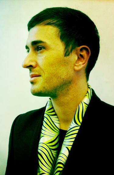 Fabien Blachier by Thuy Tien Crampton.
Laying foundations for a collection, textile designers aim to build a platform that will inspire fellow designers of clothes, furniture to accessories.
Few fashion houses have invested in in-house textile designers. Those that have – Kenzo, Etro, Marni, Dries Van Noten and Shanghai Tang – use textile prints as part of their DNA.
At Shanghai Tang, Fabien uses textiles to put classic Chinese shapes in a new light.
“As a Chinese luxury brand targeting a global audience, we constantly seek to balance modernity and tradition, East and West,” Fabien said. “Above all, we don’t want to create cliché-style Chinese costumes.”
Inspired by the film “In The Mood For Love,” Fabien recently created a collection that was very graphic and bi-color. Not very Chinese.
“In 1960s Hong Kong, the Chinese imported Western fabric for their qi pao,” Fabien said. “I wanted to give a flavor for the era.”
 Shanghai Tang textile print: SS 2010/2011. Inspired by "In The Mood For Love".
Sadly, even the most beautiful prints can get lost in the hands of a bad fashion designer. Designers are more at ease employing color, Fabien said, but few appreciate or understand how to work with textile prints.
“I have experienced disappointment quite a few times through misuse of beautiful fabric,” Fabien said. “Fashion designers need to know how to break a print, mistreat it, place it, give it shape.”
“Ideally, textile and fashion designers should work together to balance pattern and form,” Fabien said.
“Dries Van Noten, Marni, Etro, Hermes are among the few fashion houses where patterns are revered and mastered. They know how to contrast small and larger patterns, embrace opulence, use colors, and build up texture,” Fabien added.
For this year’s Spring-Summer collection, Fabien focused on the Miao hilltribe for inspiration. An ethnic group scattered along China’s mountainous border with Southeast Asia, the Miao (also known as the Meo or Hmong) wear indigo outfits with intricately sewn embroidery.
“The Miao theme has never been developed by designers, but they are rich with creativity and art, ranging from jewelry to original patterns,” Fabien said.
Throughout the collection Fabien used butterflies, a Miao symbol of beauty. An additional benefit is that Miao outfits are often square-shaped, which highlights print patterns.
 Shanghai Tang textile print: SS 2011/2012. Inspired by Miao hilltribe.
 Shanghai Tang textile print: AW 2010/2011. Inspired by jade jewelry.
Prior to Asia, Fabien was a textile designer at Kenzo, a fashion house known for its reverence and mastery of textile prints and colors.
Attracted to the East, Fabien moved to Hong Kong five years ago, working at Shanghai Tang. There, he has nurtured a real print culture.
-
YELLE | 1 | le fun & l’élégance.
-YELLE — Julie, Jean-François and Tanguy — burst onto the music scene in 2006 with their UFO bubble-gum-techno-rap “Je Veux Te Voir”. Since then they’ve collaborated with the likes of Katy Perry, Crookers and Robyn, and seduced audiences all over the world. They’re basically the first French-singing band to achieve international success since the Rita Mitsoukos. Now they return with their second album, SAFARI DISCO CLUB.
For this 3 part interview, René Habermacher shot Julie exclusively for THE STIMULEYE wearing the new MARIOS SCHWAB Fall/Winter 2011 collection. Styled by Ines Fendri, Make-Up by Akiko Sakamoto.

Yelle in Marios Schwab FW 2011. By René Habermacher, styling Ines Fendri, make-up by Akiko Sakamoto.
ANTOINE ASSERAF: Let’s talk about your new album first, SAFARI DISCO CLUB, there’s an immediate visual concept from the name to the album and on to the double music video…
JEAN-FRANÇOIS aka “GrandMarnier”: Actually it’s something that was not there to start with but added at the end. We found the name SAFARI DISCO CLUB very late into the process, at the last minute almost. We thought we should keep things simple, find 2 tracks from the album to start with.
The most inspiring track in terms of visual adaptation was SAFARI DISCO CLUB. This double-theme made us naturally think of Jean-Paul Lespagnard [whose styles had inspired the CE JEU video] and his penchant for double-themes, for juxtapositions. So we discussed it with him, with some references such as the final scene of Luc Besson’s SUBWAY, in explorer mode.
The only thing I remember about this film is Isabelle Adjani’s punk “fuck you” dinner scene…
JEAN-FRANÇOIS: It turns out that Julie’s hair in the video is not far from Isabelle Adjani’s, but that’s pure coincidence…
But the explorer look, that was something stuck in my head — it’s a bit why I started to get into music: I was such a big fan of Jean Reno playing the drums in the subway as a kid, it left an impression on me. So this final scene where they play music dressed like explorers was the starting points for Jean-Paul to work from…
So, do you feel that this SAFARI DISCO name applies to the album as a whole ?
JEAN-FRANÇOIS: It definitely gives a tinge — from the moment we had the title, we listened to the tracks differently, you hear the percussions more. The word “safari” also brings the meaning of “discovery,” which works because we had applied ourselves to making all the songs very distinct. We feel very much part of the compilation generation!
It all works out in the end, but once again it wasn’t thought out that way, we made the songs really one by one.

Safari Disco Club album cover by Grégoire Alexandre. Styling by Jean-Paul Lespagnard.
There are some African vibes in the title track and on LA MUSIQUE…
JEAN-FRANÇOIS: There is a percussion side, coming from the live… Julie has a Tom Bass, we have these suspended drums, we really base ourselves on the percussions for the live show, constructed a bit like a DJ set, with transitions — that really rubbed off on the way we composed for this album.
TANGUY “TEPR”: We didn’t want to copy anything, it’s just a slight tinge, nothing too ‘in your face’…
JEAN-FRANÇOIS: On SDC itself, the most obvious thing in terms of inspiration is the guitar gimmick which is almost Zouk.
Both LA MUSIQUE and SAFARI DISCO CLUB are very instrumental tracks, very percussion-driven, you’re in a sonic trip with words just guiding you on your way…
JEAN-FRANÇOIS: It’s less constructed.
JULIE: Less of a traditional song format.
JEAN-FRANÇOIS: The voice is used more like an instrument, on POP-UP it was more spoken.
TANGUY: Julie’s way of singing changed, not in a calculated way but gradually while writing — it was very spoken and broken on POP UP, on SAFARI DISCO you find this style only on one track really: COMME UN ENFANT. We wanted to try new things.
(more…) -
Lori Pauli | Behind the 19th-Century British Photographs.
-Lori Pauli is the Associate Curator of Photographs at the National Gallery of Canada, home to more than 25,000 photographs in a collection that started in 1967.
She has recently put together the exhibition 19th-Century British Photographs; the third in a series of five exhibitions of selected masterpieces of the collection of the National Gallery. This exhibition traces the development of photography in Britain over the course of the Victorian era; from early, salted paper prints, to daguerreotypes, to magnificent turn-of-the-century platinum prints.

I met Lori at a guided tour of the exhibition. Ann Thomas, also a curator at the National Gallery, whom I had met in one of the events I organized introduced me to her and we briefly talked about meeting up to chat about Mexican artists included in the collection amongst other things.
Not too long after we met and talked about astrophotography, the Moderna Museet in Stockholm, Ron Mueck, her twin sister and some of the cultural differences I have noticed while in Canada.
For my first contribution to The Stimuleye, I will be sharing some of the questions I had for her on the exhibition.
Miguel Batel: How did the idea for this exhibition came together?
Lori Pauli: Basically, with our drawings collection we started a series of exhibitions based on our holdings, so we decided for photographs we would do the same thing. The first one was modern photographs from the collection, then we did 19th-Century French, and after this it will be American Photography from 1900 to 1950.
The fifth probably will be either American 1950 to the present, or possibly our holdings of Canadian photography.
Will this exhibition be travelling?
It will, I’m not sure exactly where it’s travelling, we have had interest from across the country, and we are just deciding where its going to end up.
How many photographs did you have to go through, and how many are currently exhibited?
There are about 112 photographs in the show, and I think I went through 2,000 in terms of 19th-Century photographs from the collection, so there was quite a bit to choose from, which was great.
The exhibition features some of the earliest photographic techniques. Which are some of the photographs you would consider to be the most important?
Well, of course some of the earliest would be the daguerreotypes, and we have a really great daguerreotype, that is quite large format; I don’t know if you remember it, but its of a man called John Berret Nelson and its around 8” by 10”, its fairly large compared to what normal daguerreotype sizes are. It’s called a mammoth plate, its beautifully created – masterfully crafted- and it comes with its original frame as well, so that is a real gem in the collection.
In terms of British we have a lot of salted paper prints by William Henry Fox Talbot, so those are other also really important pieces, because that’s the inventor of paper photography, it’s really great to have those.
Are there any borrowed items?
No, it is all from the collection.
You acquired some photographs for this exhibition, any specially difficult one to get?
One of them was the piece of armour, we think its by a woman called Jane Clifford. She was married to Charles Clifford, who was the most important photographer working in Spain. He made a lot of use of Queen Isabelle II construction projects and he did use of her armoury and her treasures. We recently acquired that.
-
25 Hyères preview : Walter Pfeiffer
-The 26th edition of the Hyères International Fashion & Photography Festival is fast approaching, and soon our film on the 25th edition will be out. Here’s a quick preview, featuring a visit of Walter Pfeiffer’s exhibition by Michel Mallard…
Excerpt of upcoming film "25 Hyères". by Antoine Asseraf
Dries Van Noten, Steven Klein, Oliviero Toscani, Theo Mercier and much more in the full documentary.
26th Hyères Fashion & Photography Festival, April 29th – May 2nd 2011.
-
dimitris papaioannou : spatial and human relationships
-SPATIAL AND HUMAN RELATIONSHIPS
Continuing the conversation with Greek choreographer Dimitris Papaioannou, this second part concentrates on his post olympic work as MEDEA2 and the influences of butoh and his native Athens in his work.
 Scene from MEDEA2 by Dimitris Papaioannou. Photo by René Habermacher
RENÉ HABERMACHER: Over the years your journey has brought your work to ever-larger audiences. Recently, with your play MEDEA2, you revisited the past. How was that experience?
DIMITRIS PAPAIOANNOU: It challenged me for a number of reasons. If you follow my journey, I was violently exposed to the general public with the success of the Opening Ceremony of the Athens Olympic Games. In order to recover from the experience, I had to take a two-year break.
The first thing I chose to do after this pause was a show called 2. 2 was actually an attempt to pick up where I had left off before the ceremony, to return to my roots and re-evaluate my work. I constructed a very personal show on a large scale because I was offered the opportunity to do so, and I tried to restart my interrupted line of development in an unusual way.
After this experience many question marks arose, and I realised that I was still exposed to a much larger public than I was used to. I had the feeling that there was a new kind of communication being created that was both charming and dangerous. I needed more time before taking my next step.
 Jason crossing the sea. Scene from MEDEA2 by Dimitris Papaioannou. Photo by René Habermacher
Many people were suddenly exposed to my work through the Olympics, but of those who had a real interest, many were too young to have experienced MEDEA. So I returned to MEDEA, attracted by the idea of presenting it again with an all new cast, and approaching it with a new idea: to take the passion out. I wanted to reconstruct it, refine it, clear it out, strip it of anything unnecessary, drain the blood from the performance and deliver it in the cleanest form I could manage. That was my intention with MEDEA2.
Having done that, I could continue with new work, first NOWHERE and now INSIDE. This is a completely new phase, where I am tending to create shows with no protagonists and no characters. The crowd is the element I’m focusing on now, using it in a more open structure in order to create images involving spatial and human relationships.
Excerpts of MEDEA 2 accompanied by interview with Dimitris Papaioannou.
-
MATTHIAS VRIENS McGRATH EXPLAINS TO FILEP MOTWARY EVERYTHING ABOUT BL33N, HIS NEW PROJECT ALONG WITH HIS HUSBAND DONOVAN
-Its been almost a decade since Dutch magazine closed down and almost six years since my last official conversation with Matthias Vriens. In between and later, many emails regarding our personal news, ideas and hopes took place.
Matthias recently married to Donovan and since then, they both sign as Vriens-McGrath. For a while now I was informed about a new project they have been preparing, BL33N, but finally the mystery is solved, since our last night’s conversation..
BL33N (pronounced BLEEN) is a project by Donovan and Matthias which will oficially launch in May 2011. Since yesterday a rather tantalizingly sexy trailer hit the web in order to prepare us for what’s coming. Bl33n will be an online magazine experience, where all material shot by Donovan and Matthias as a team will support the t-shirts that they sell. By Matthias Vriens-McGrath.
The first collection is inspired by the body. Its design placed inside the shirt, when turned upside down will become a mask when worn over the face while others will include hair prints on shoulders and back that look like heavy metal or jewelry printed in mirror silver and latex. Printing technics will include latex, glitter. Their aim is to open up to a world wide collaboration of people connecting globally and will include a lot of world travel with the brand, while promoting freedom for all.
“Filep, free, freedom is something we take for granted and not available to all of us. Such an abstract, intellectual property, yet essential for all. We would like to promote freedom for all and with bl33n we intend to do just that. Part of our profit will go to promote freedom.”

FILEP MOTWARY: So Matthias,how did you come up with the idea of BL33N?MATTHIAS VRIENS-MCGRATH: By accident via google, we found bleen, then bought intellectual property of bl33n.
You were one of the founders of published bible DUTCH MAGAZINE back in the late 90’s and early 00’s. How do you see yourself creating a web-platform?
We are just doing it… and take it from there. As we both have never been one to over-think or over intellectualize matters.
Whats the web’s real power today regarding fashion?
I believe pretty strong, information is scattered around in seconds, no where to hide. As horrid as it can be, once embraced it’s pretty cool and exciting.
Your new project along with your huspand surrounds a variety of actions including orthologic actions like promoting ideas like “freedom for all”. What do you really mean with this?
Our believes are visual delights and as simple as that might seem, the human body in all of it’s glory remains a struggle. Nudity as a metaphor for freedom and its something we all have, yet not available to all of us. Seems simple no…?
I would like to know more about the t-shirt collection you are preparing?
The first collection relates -again- to the body. Monster faces, printed upside down, inside out, become masks when pulled over your head. hair prints draped over back and shoulders printed in latex become ornamental, sculptural jewelry. There will be several collages-shirts that connect to the contemporary art world, while others are printed with the BL33N logo placed on parts of the body that become ‘questionable’
Are you thinking or extent it to a complete collection in the coming future?
Yes, both Donovan and feel strongly about underwear for example, but all in time…
-
dimitris papaioannou : a pasolinian touch
-Dimitris Papaioannou’s work as a choreographer has significantly reshaped the Greek performing arts landscape.
With his directing of the Athens 2004 Olympic Games Ceremony, a ground-breaking success, he played his way straight in the heart of the spectators, hailed a “triumph” by TIME MAGAZINE and THE TIMES of LONDON.In 2005 Dimitris Papaioannou was awarded the Golden Cross of the Order of Honour by the President of the Hellenic Republic for outstanding artistic achievement. For his following shows “2″ and MEDEA2 enjoyed an unprecedented run in the Greek capital, each with over 100 000 tickets sold. This accelerated development came not without controversy. With his latest play INSIDE Dimitris returns to his experimental roots.
THE STIMULEYE met with him during a break of rehearsals in Athens, to speak about his new play and look back to his point of departure.
Following the first part of three on the conversation with Dimitris Papaioannou, accompanied with exclusive pictures by René Habermacher. Dimitris Papaioannou on the rehearsal set for his new play INSIDE. Photo by René Habermacher
pasolinian touch
DIMITRIS PAPAIOANNOU: I’ll be right with you — I’m just making a coffee!
RENÉ HABERMACHER: You’re freshly shaven! You look very 19th-century with your moustache.
I am from the 19th century honey, I’m very old!
It’s been a while since we had time for a talk, since I left Athens and you last visited Paris. We met only briefly during the rehearsals for your new play INSIDE, which you’re currently working on. You spent last Spring in New York. Tell me about what you did there.
I was there from March until June on a Fulbright Artist’s Scholarship. A mid-career scholarship obviously… [laughs]
Actually in a way I was studying the story of performance art [with Laurie Anderson at The Kitchen NYC] and developing my Final Cut Pro skills, as well as experiencing a little more of New York life, now that I’m a mature boy and things are different!
How was it returning to Athens after that?
For me it was a blessing because I discovered that I had left New York when I was still under construction. It’s the perfect place to be when you are like that, but in this phase of my life what I found there was a little more superficial than I would have liked. The Athens I returned to was in complete economic crisis and emotionally depressed, but still I was deeply relieved to spend summer back home.
Dimitris, I know you were born in Athens, but we’ve never talked about your childhood.
I was born and grew up in Athens, in a lower-middle class family. My parents made financial sacrifices so that I could go to a very expensive school, the Athens College. Then I had to run away from home because my parents wanted me to live the life of a straight architect. But I was a gay man, and I wanted to be a painter. I became the student of the Greek painter Yannis Tsarouchis* (1) in the old fashioned way, where painters trained people in their atelier. It was there I was introduced to true art. I had been painting since I was a child, but it was when I met Tsarouchis that I realised what painting really was. Later I entered the Athens School of Fine Arts.
* (1) : Yannis Tsarouchis, 1910-1989 One of the most important twentieth-century Greek painters, Yannis Tsarouchis portrayed and helped to define modern Greek identity. The deeply sensual painter was much influenced by the French impressionists and often depicted sailors, soldiers and the nude male body in erotic situations.
 The departure of Jason in reference to Yannis Tsarouchis. Scene from MEDEA2 by Dimitris Papaioannou
How did you meet Tsarouchis?
I knocked on his door. I showed him some my paintings and asked for his comments. He was not cruel, as he could have been, about those awkward early drawings — instead he was very polite. My college had organised an exhibition of my work in the building’s library, so I invited Tsarouchis to see my work up close. The next day he called me and invited me back to his house, after which he allowed me to watch him paint, and would give corrections on my paintings. I became his student.
How did this encounter shape you? Did it leave a mark on your artistic work?
Well, your first mentor leaves a strong mark on your life. I grew up in a house that had no contact with artists, there wasn’t a single painting on the walls. My parents weren’t very fond of art, it wasn’t part of their lives. I felt like an alien, wanting to enter this world. So Tsarouchis was the first artist I really saw working, and I realised that the life of an artist is possible and, to my eyes, very charming. I felt at home in a way. And he was a great painter. He had a quality that interests me a great deal: he could make magic with the humblest of materials — he could make roses out of toilet paper, use wires to make small sculptures. The thing I think I have learned from him is that you can make poetry out of garbage.
 “Helios”. Scene from MEDEA2 by Dimitris Papaioannou. Photo by René Habermacher
 -
EYE 2 EYE: la lutte de l’amour
-Caroline Daily interview of Antoine Asseraf about “La Lutte de L’Amour” (The Struggle of Love), the SS2011 film he made for Erotokritos.
Caroline Daily: what is the first film which made an impression on you ?
Antoine Asseraf: The most striking memory for me is David Lynch’s Lost Highway.
It was my first Lynch, and the mix of glamour and goth, the changes in personality, the concept of looping, free intepretation, all left me without voice.With David Lynch, there is always a staggering artistic direction, a mix of architecture, music, design and casting which create entirely novel worlds.
In a different register, there is also Danny Boyle’s Trainspotting, which left a mark because it’s such a violent film, but with an “english” type of violence – very different from the hollywood violence to which i had grown accustomed.

-
sensibility embedded in its fabric
-The Victoria and Albert Museum presents one of the most influential and enigmatic fashion designers of the last forty years: Yohji Yamamoto. Shortly before the opening, THE STIMULEYE caught up with V&A Contemporary Curator Ligaya Salazar, curator of this installation-based retrospective, exploring the work of a designer who has challenged, provoked and inspired with designs that have rewritten notions of beauty in fashion.
 YOSHJI YAMAMOTO Photography Nick Knight, Art Direction Peter Saville
“The timeline will consist of a mixture of clips of key fashion shows from the last 30 years of his illustrious career, some bits about his main collaborations in film, performance and photography and some very special extras. I hope that this will help shed light on Yamamoto’s extraordinary approach to collaboration” – Ligaya Salazar
On display are 80 women’s and menswear garments, which are most representative of his work that is recognised for subverting gender stereotypes and has featured women wearing garments traditionally associated with menswear. The exhibition also includes menswear items from the Autumn/Winter 1998 season which was famously modelled on women.
Accompanying the exibition, Ligaya produced a series of images with Nick Knight, styled by Katie Grand, and edited a stunning Book that also sheds light on Yoshji Yamamoto’s relationships with other creative collaborators: including Peter Saville, Marc Ascoli and M/M (Paris), Pina Bausch and filmmakers Takeshi Kitano and Wim Wenders.
René Habermacher sat down with curator Ligaya Salazar for a chat on this and her curatorial work on the projects…
RENE HABERMACHER: Hello Ligaya! how is things? Tense, so short before the opening?
LIGAYA SALAZAR: Ha! We are actually a little ahead of schedule, awaiting Yohji’s visit
Now i am impressed!
Yes he will be coming to the V&A after his Ready-to-Wear show to check everything is in order and to paint on the gallery walls!
I would assume usually that would come first- the painting….
Oh no — not painting the gallery walls, he will be painting life-size silhouettes on the wall behind and amongst the mannequins. It will be very special.
(more…)


